60

As what Stack Overflow has to offer folks has grown considerably in the last year, we're going to be testing some changes to the top navigation that we hope will help new users find all of the things that the site has to offer.

tl;dr;

The top navigation part of the site has always been extremely cramped. Now that we have Documentation and Jobs, we're left with even less space to contend with, so we'd like to try something new. Additionally, we want to make sure new users become at least aware of the other things the site has to offer beyond Q&A.

If you arrive to the site anonymously, you'll have a random chance of seeing the new nav on your first page load.

What does it look like?

Glad you asked :) It looks like this:

Shiny!

How long is the test going to run?

We expect the test to run for approximately a week. The thing about these kinds of tests is you never quite know until you start seeing data. If we realize that tweaks are needed, or we didn't measure something that turns out to be important, it might take a few weeks instead.

I have some feedback based on the image you shared

That's great, and we totally welcome it. But this is a very, very early attempt to see if we're going in the right direction. If the test looks promising, we might look to test with some logged in / experienced users also. We'll just have to see how the numbers pan out on this one.

I'll update this post with our results, and let folks know what our plans on. There will be a separate discussion way prior to any major changes being rolled out - this is just a test.

Is this specific to Stack Overflow?

Yes, this applies only to Stack Overflow.
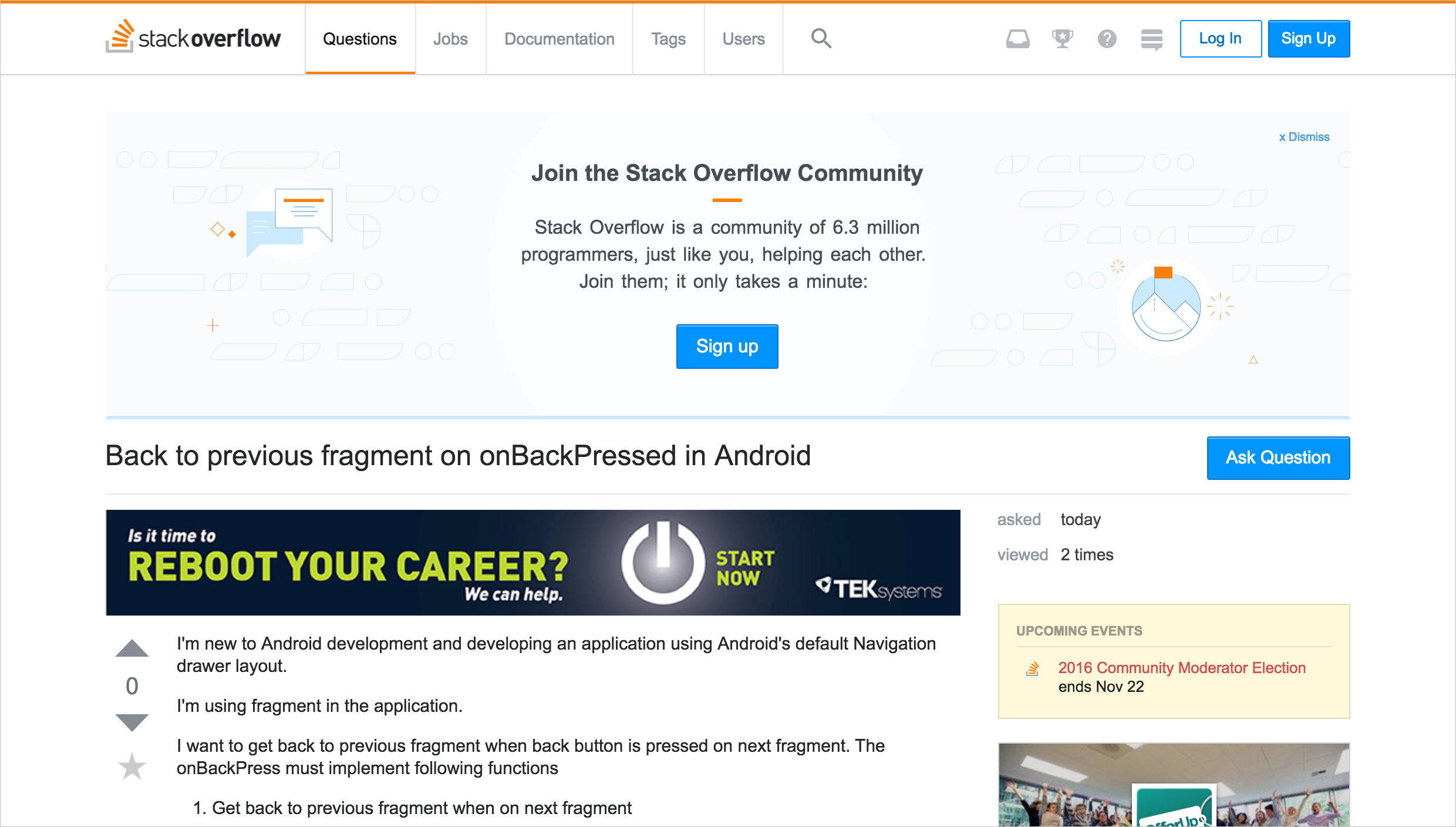
14
  • 69
    I have some feedback. I ABSOLUTELY DO NOT WANT THIS!!!! FIRST TRUMP NOW THIS!!! 2016 IS TERRIBLE
    – Pekka
    Commented Nov 11, 2016 at 15:24
  • 28
    Seriously though, any departure from the good ol' design (which still looks decent after 7 years! What a feat!) will earn a silent tear from me. Although this newfangled thing does look more usable. Where will the SE bar go, on top?
    – Pekka
    Commented Nov 11, 2016 at 15:24
  • 28
    Don't worry @Pekka웃 - We're going to make the hyphen site pay for it. (ducks) All seriousness, I have the same nostalgia that you do, there are very few parts of the site that have remained relatively untouched since the beginning and it's amazing that they held as long as they did. I'm getting a little teary just talking about it, sniff.
    – user50049
    Commented Nov 11, 2016 at 15:27
  • 6
    @Pekka웃 We're not sure about the SE bar, right now you can reach the list of communities and stuff by clicking on the SE icon to the right. Also not pictured is the 10k / mod icons and stuff. Right now we're just confirming some assumptions regarding how it will better distribute the anon traffic across the various parts of the site. If we get that right, then everything else can fall into place. If the test fails, then there's little sense in working on this concept much more.
    – user50049
    Commented Nov 11, 2016 at 15:29
  • 40
    @Pekka웃 git reset --hard 2015
    – Braiam
    Commented Nov 11, 2016 at 18:12
  • 6
    Design overhaul long overdue for a site as good and useful as StackOverflow.
    – the12
    Commented Nov 11, 2016 at 23:13
  • 8
    @Pekka웃 #NotMyStack ;-)
    – Naftali
    Commented Nov 15, 2016 at 18:18
  • 2
    Please no! Don't change this. This nav bar is unique to all the Stack Exchange sites, and unique! Commented Dec 10, 2016 at 18:28
  • 3
    As these changes go on, eventually Stack Overflow will mostly be rendered by CSS, regex, and JS from my own system ;) Commented Jan 10, 2017 at 21:07
  • From the screenshot, the new system actually looks a lot better in my opinion. Yes, there's nostalgia as the old one's been around so long. I especially like how the two bars are unified. Just thought I'd say this to show not everyone hates the new layout! ;-) Commented Jan 19, 2017 at 17:17
  • Any reason you take Stack Overflow out of Stack Exchange network? Because with all the "Stack Overflow only" changes, it surely looks like your goal. (which is bad idea IMO.) Commented Jan 22, 2017 at 9:25
  • 1
    I want old SO design back Commented Feb 15, 2017 at 9:15
  • I never want anything old back :P Commented Oct 19, 2017 at 7:16
  • I had to go for a little search to find the old design, and I have to say, new design is SO SO MUCH better Commented Dec 21, 2017 at 17:02

7 Answers 7

51

I have some feedback based on the image you shared

You appear to be following the fashion of representing a search field by a small icon of a circle with an appendage. As a user of other sites, I always find this frustrating. The smaller area makes it harder to spot. It's also harder to activate the field: there's no placeholder text indicating where I can click to get a caret and start typing.

And as a user of Stack Overflow specifically, I think it's a bad idea to make it harder to find or use the search field. For general site use -- and especially for anonymous users -- that's the most important nav option; it's not even close to being on par with the raw "Questions" or "Users" lists.

That said, and in the same vein, kudos for removing the "Ask Question" button!

9
  • 7
    That also struck me the first few times that I used it, until I kinda learned the right place to land on it. I'll make sure that gets passed along. Other feedback has indicated that there needs to be some more contrasting color, so the latter might help solve the former.
    – user50049
    Commented Nov 11, 2016 at 18:07
  • Sounds good, thanks Tim!
    – jscs
    Commented Nov 11, 2016 at 18:08
  • 1
    Also, the "Ask Question" button will be there, but we want to be sure folks have taken a half-decent look around before we show it. There's probably like 10 or even 15 specific parts of this we'll have to test before we find the best design (including how it unfolds) that we can come up with. Test-for-test, this might end up being the most tested piece of tiny screen space we've ever done :)
    – user50049
    Commented Nov 11, 2016 at 18:14
  • The screenshot has been updated with the location of the 'Ask a Question' button.
    – Kurtis Beavers Staff
    Commented Nov 11, 2016 at 19:19
  • 12
    @TimPost "kinda learned the right place" is a non-starter for the average user. At least ensure they've found and used the search box before showing them the Ask Question button. Commented Nov 12, 2016 at 2:04
  • 1
    @JeffreyBosboom not exactly related but sorta — we're working on separate updates to the 'ask question' page that will likely include even more explicit outlining of questions that may have already been asked.
    – Kurtis Beavers Staff
    Commented Nov 12, 2016 at 23:22
  • 2
    @KurtisBeavers once they click the "ask question" is already too late: you have already stated that they need to ask the question no matter what and they follow your instructions. Flip the ask question with the search button, you will see how new questions will plummet and search will skyrocket.
    – Braiam
    Commented Nov 15, 2016 at 18:48
  • 9
    This. Exactly this. Our biggest problem here is trying to get users to search the site first, before asking questions. Hiding the search field, or otherwise making it difficult to spot, is not going to help with this. We are a lot like Google in that we have a large volume of useful content, to which we want to direct people. Search should be one of the #1 features that we offer to users. The search feature should arguably be 50% of the top nav bar, not buried behind an icon.
    – Cody Gray Mod
    Commented Nov 23, 2016 at 11:54
  • 1
    @CodyGray in the experiment we will be tracking number of searches ran in both the new and the current version (among other things.) If it performs worse, we'll make adjustments and test again. It's unlikely that the screenshot above represents the final iteration.
    – Kurtis Beavers Staff
    Commented Nov 23, 2016 at 12:18
18

How does

The top navigation part of the site has always been extremely cramped.

lead to adding more things to it? The new version is clearly more cramped. If you mean vertically, then good; the current version is nice and small and stays out of the way.

It also:

  • De-emphasizes the Review queues link
  • Hides current reputation (I definitely don't see any room for it.)
  • Maybe does away with the user link? (I use that all the time to see what happened on my recent posts/comments!)
  • Apparently does away with the searchable StackExchange drop down
  • De-emphasizes the search (something that should be used more, not less)
  • De-emphasizes the help (something a great many users need emphasized for them)

My first thought when I saw this was, "SO wants to get more traffic on Docs and Jobs." If that's what you're really trying to do, please just say so. This change doesn't seem to have any other actual benefit.

1
  • 2
    I imagine the user link & current rep would be in place of the login/signup buttons.
    – SeinopSys
    Commented Jan 9, 2017 at 23:51
11

I have an issue, in two parts. Both are related to the as-yet-unexplained iconography.

  1. You seem to be replacing the long-used and well-understood "rep" button (vertical lines of various heights as in a column chart) with a trophy that has a star in it. Or are you? It's not clear from your posting.

  2. What is the visual combination of the "hamburger" and "voice balloon" supposed to represent? In recent years, the "hamburger" (three horizontal lines stacked) has been coming to represent "options" (i.e., replacing traditional text menus across a horizontal strip). The voice balloon means different things depending on whatever site you're on. I think combining those things, while it is clever and no doubt solved some designer's immediate problem, is unnecessarily confusing. Or is it? How would we know absent some description of what these things do?

Again, the problem is that I don't see anything that explains the iconography. Perhaps you can edit this post to make it more informational.

4
  • 6
    The second one is the Stack Exchange logo, which currently appears on the left.
    – Shog9 Mod
    Commented Nov 12, 2016 at 16:09
  • @Shog9: Ah, I didn't recognize it because in the current version it merely functions as a decorative element alongside some text, with no semiotic significance. I've never had to even look at it closely. Now it has to function all by itself, and against a light background so that it is fully visible (the dependent arrow especially, which disappeared into the black before). Which brings up my confusion.
    – Robusto
    Commented Nov 12, 2016 at 16:22
  • 2
    Probably doesn't help that it loses the color gradient; I hadn't noticed how much that makes it look like a hamburger menu, but now that you mention it if I wasn't already familiar with the logo... Well, I guess that's why we test. FWIW, in the mobile theme we use an actual hamburger menu icon coupled with the site's logo on the left to perform the same function; perhaps we could get some consistency there eventually.
    – Shog9 Mod
    Commented Nov 12, 2016 at 16:36
  • 5
    We did user interviews with a reputation icon that was the same as the current live version, and most users (including higher reputation users) didn't immediately know what it meant. Several thought it was activity, others thought it was settings (like radio slider dials.) This is the reason that we're looking into tweaking the design of the reputation.
    – Kurtis Beavers Staff
    Commented Nov 12, 2016 at 23:20
7

Couple of things on my end:

Make it easier to log out...Most places have the log out on the top right - SE goes against this and tucks it away on the top left menu? WTF. I had a hard time just finding this - it should be intuitive and easily located.

Make the ask button stand out more - prime example - use workplace.stackexchange as an example. Notice the ask question is put in a little sticky note in yellow very noticeable and easily located. Why can we not do something similiar on this site?

4
  • 12
    I have a feeling the SO community as a whole would rather see the "Ask Question" button be harder to find, not easier, in a effort to reduce the garbage questions that come in. Commented Nov 22, 2016 at 16:25
  • Thats no excuse for this type of design - if people who really do need to ask a question cannot find a way to ask the question they will leave the site.
    – JonH
    Commented Nov 22, 2016 at 16:26
  • 1
    In the experiment, we're carefully tracking the number of questions asked in the new version vs. the current one. It's very likely that the final version we launch with is not exactly what is shown above, but a result of a few consecutive experiments.
    – Kurtis Beavers Staff
    Commented Nov 22, 2016 at 19:13
  • 7
    We plan on moving the log out button in a future iteration. It's something that came up multiple times in user testing (and simply doesn't make sense where it currently is.) All that to say, we hear you.
    – Kurtis Beavers Staff
    Commented Nov 22, 2016 at 19:13
6

Is this specific to Stack Overflow?

Yes, this applies only to Stack Overflow.

But will this design eventually be rolled out to all the other sites? I think that it should - or at least have a design that can work across the network. I frequently visit other SE sites and I think that the transition between designs would be jarring for me and possibly others. For example, the location of the inbox and achievements buttons is on the right side in the new design.

1
  • 4
    this refers to the AB testing AFAICT. I would assume that whatever the end product is after their extensive testing will be applied network wide, in the same manner as any other changes.
    – user4639281
    Commented Dec 30, 2016 at 20:36
2

Stack Overflow is part of a bigger network of sites.

True, it's the biggest, it's the main income revenue, but it's still one Q&A site in network of 150+ sites.

And this change will cause the site to appear as if it's not part of this network. You're actually taking Stack Overflow out of Stack Exchange.

As with any big change, it will take time to get used to it, but having it only for one site will make users who are active on other sites in addition to Stack Overflow confused and irritated (well, at least me) from the totally different design between Stack Overflow and the other sites.

Bottom line: I think this is a mistake.

-2

I am personally quite neutral to any change but as I understand, it is addressing new users.
So my first impression would be: is it not kind of, ehm, boring? excuse me for such expression. I don't mind personally, I like boring design. But there is so little contrast and volume in the bar.

Also I think it is not a good idea to put everything in one line. The gaps between clickable elements is so small, and the icons are slightly too small. So it looks too condensed. I like when sites have narrow, fixed column design in general, not extending the top bar much to the sides, it is easier on eyes and to navigate.

What I would probably make: put main buttons right below the logo, make them more prominent and more contrast. Then one has more place for the search bar also, which could be extended to the right.

Something positive: I really like that there is no black stripe on the top, in this sense it is definitely more pleasant than current design.

You must log in to answer this question.