58

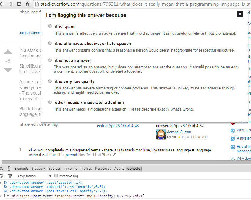
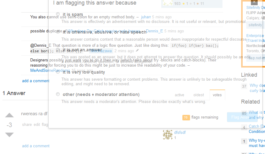
On an answer with 3 or more downvotes, the flag window is semi-transparent, like the answer, which makes the flag options hard to read and select:

Semi-transparent flag window

The problem is also visible with the share window (which also seems to appear below "Your Answer"):

Semi-transparent share window

Steps to reproduce:

My browser is Firefox 36.0.4.

9

3 Answers 3

9

I have pushed a fix for this to dev. It will be on live after our next build. Thank you those who suggested solutions.

14
  • ETA when the next build arrives? (hours? tomorrow? :)) Commented Mar 30, 2015 at 12:37
  • Is this a fix for the network-wide request?
    – Mooseman
    Commented Mar 30, 2015 at 12:44
  • I'm curious how you solved this. ETA is nice to know indeed. Commented Mar 30, 2015 at 13:01
  • @ShadowWizard it should happened within the next 24 hours. More likely in 12 hours.
    – Jin Mod
    Commented Mar 30, 2015 at 13:15
  • @Mooseman yes it will be fixed network wide.
    – Jin Mod
    Commented Mar 30, 2015 at 13:15
  • @BramVanroy should happen within 24 hours. The fix was, instead of setting .5 opacity on .downvoted-answers div, I limited the opacity to its .post-text, .post-signature, .votecell, .comments divs only. So this way it doesn't affect the popup div.
    – Jin Mod
    Commented Mar 30, 2015 at 13:17
  • Not the most elegant solution, but I suppose it does the job. ;-) Commented Mar 30, 2015 at 13:19
  • @BramVanroy Ideally it'd be nice if the popup html isn't contained in this. It's something I may still talk to our devs about. But for now, the CSS fix is the easiest and fastest to do.
    – Jin Mod
    Commented Mar 30, 2015 at 13:20
  • @Jin Does this fix include the z-index?
    – Mooseman
    Commented Mar 30, 2015 at 13:53
  • @Mooseman yes it should.
    – Jin Mod
    Commented Mar 30, 2015 at 14:24
  • 1
    Can you also mark these two MSE posts as status-complete? Commented Mar 30, 2015 at 17:10
  • 7
    The problem still persists for the flag dialog on comments to downvoted answers. I guess the same treatment using an even messier collection of selectors should fix it.
    – epimorphic
    Commented Mar 30, 2015 at 21:56
  • 2
    The issue continues.
    – Jason C
    Commented May 1, 2015 at 0:50
  • 1
    Still an issue... Commented May 21, 2015 at 14:41
15

Either the modal needs to be appended to a different element, or the css opacity needs to only target the votecell and the post-text elements.

You can see the css change in action with this simple javascript

$('.downvoted-answer').css('opacity',1).find('.votecell, .post-text').css('opacity',0.5);

enter image description here

7
  • Surprise, surprise...
    – idmean
    Commented Mar 27, 2015 at 20:11
  • 29
    It must be easy for the developers to fix bugs on a site full of programmers since the people reporting the bugs also fix them!
    – NobodyNada
    Commented Mar 27, 2015 at 21:55
  • 15
    @NobodyNada I know you're joking, but verifying that a change fixes a bug is not enough. It also needs to be verified that a change is correct, and introduces no other bugs. That's hard. The approach in this answer does introduce another bug, visible in the screenshot: it doesn't set the opacity of the comments.
    – user743382
    Commented Mar 28, 2015 at 15:30
  • @hvd - Isn't that the designed behavior? It could have easily been made to do that if that was the way that the opacity originally operated.
    – Travis J
    Commented Mar 28, 2015 at 19:44
  • 1
    Also, do note this answer only highlights a way to see the fix, not a suggestion on how to actually implement a patch. This is because the stylesheets SE uses have larger implications than single situations at times, and I wanted to only show the css selection option for fixing this, not necessarily what their edited css style definitions would be as that may have other ramifications I cannot test for at the moment.
    – Travis J
    Commented Mar 28, 2015 at 19:46
  • 2
    @TravisJ I'm pretty sure the fact that the opacity is currently applied to both the post and the comments is intentional. It looks very distracting when the comments are in black. Anyway, the point of my comment is that contrary to what NobodyNada jokingly suggests, StackOverflow cannot simply copy and paste from your answer to their CSS. I'm sorry if it came across as anything more than that, that wasn't my intention, I certainly am not asking you to edit your answer so that SO can. :)
    – user743382
    Commented Mar 28, 2015 at 20:08
  • 1
    This is a good lesson, though. Commented Mar 30, 2015 at 1:22
6

As an alternative to Travis' answer, I've got a suggestion that isn't a convenient way to approach this sort of thing, but I think it's worth considering.

EDIT 29 March, 2015.

Following up on my old answer, I figured there ought to be a better way to fallback gracefully for older browsers. The first thing that I thought of was: detect browser support for pointer-events and then adjust some CSS accordingly. However, I found that it can be done a lot easier with some z-index fun.

The idea is, again, to add an overlay to the downvoted answer with a pseudo element :after. With the pointer-events: none; property, clicks will fall through that overlay so users will still be able to select text or click the Flag, Edit and Share buttons. However, this property isn't supported in older IE and so users won't be able to click these buttons in such browsers. The solution utilises the simple yet efficient power of z-index. Simply position the div that contains those buttons (.post-menu) relatively, and add a z-index that's higher than the z-index of the overlay. Ta-da, now everyone can click those buttons.

See the CodePen here, or the fullscreen demo here.

Compiled CSS

.downvoted-answer {
  position: relative;
  opacity: 1;
}
.downvoted-answer:after {
  content: "";
  position: absolute;
  z-index: 2;
  left: 0;
  top: 0;
  width: 100%;
  height: 100%;
  background: transparent;
  background: rgba(255, 255, 255, 0.5);
  pointer-events: none;
}
.downvoted-answer .post-menu {
  position: relative;
  z-index: 3;
}

Upside

  • Fixes the issue
  • Cross-browser, yay
  • Subsequent problems are easy to fix (see "Downside")
  • Doesn't require JavaScript
  • Adding IE8 support isn't hard, if you really want to. Replace RGBA by the opacity trick mentioned below

Downside

  • As we position our .post-menu relatively, and the pop-up is inside that div, you'll need to adjust the way in which the pop-up's position is determined. (Absolute positioning inside a relatively positioned element and all that.)
  • You might need to add a z-index to the pop-up

Old answer.

Upside

  • Doesn't require JavaScript
  • Fixes the problem

Downside - Doesn't work well in all browsers (see below)

.downvoted-answer {
  position: relative;
  /* opacity: 1; */
}
.downvoted-answer:after {
  content: "";
  position: absolute;
  left: 0;
  top: 0;
  width: 100%;
  height: 100%;
  background: rgba(255,255,255,0.5);
  pointer-events: none;
}

Basically what you do is creating an overlay with a pseudo-element, and let pointer events "fall through" by setting its pointer-events property to none. Unfortunately this isn't widely supported, though IE 11 supports it. (It's something.) Also consider that even though IE 8 supports :after, it doesn't support RGBA. A better approach, then, might be to use (a form of) opacity, like so.

-ms-filter: "progid:DXImageTransform.Microsoft.Alpha(Opacity=50)";
opacity: 0.5;
background: white;

I do wonder, though, why don't you use one pop-up per page? Now each answer has its own pop-up div, but why don't you simply have one pop-up element at the bottom of the DOM which you only fill with the relevant content upon click?
2
  • 4
    The site barely works correctly in IE8 anyway.
    – BoltClock Mod
    Commented Mar 29, 2015 at 2:30
  • 1
    @BoltClock Considering that, I nonetheless added an improved answer which is cross-browser. Commented Mar 29, 2015 at 12:47

You must log in to answer this question.

Not the answer you're looking for? Browse other questions tagged .