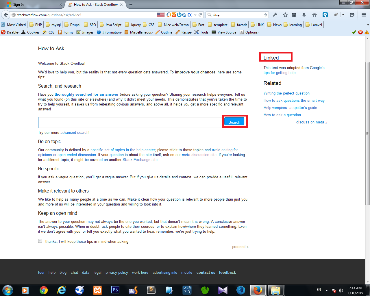
I found these little CSS problems on Stack Overflow (red bordered).
Seems to me like a couple of CSS class issues.
.module doesn't have any top padding. Changing that to 10px made the appearance look a lot nicer.
The button's a bit fiddlier. .search-button is changing the height of the overall button to 2em; if that's removed, sure the button's a bit bigger, but it lines up nicely with the text in the center.
Thank you for the fix Makoto. I have pushed a fix to dev. The change will be on live after the next production build.