22

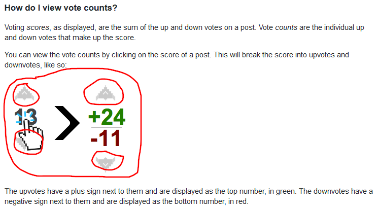
The Help Center > Privileges > Established user page currently looks like this:

Screenshot showing the awful vote up/vote down buttons

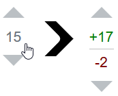
The image shows the vote up/vote down buttons from before a redesign - the image should really be changed to look something like one of the following1,2,3:

Sample new image 1. Use this one if you want - I don't mind.

or

Sample new image 2. Use this one if you want - I don't mind.

to avoid the inconsistency.


1 I wanted to find a post which had 24 upvotes and 11 downvotes for consistency, but couldn't (easily) and couldn't be bothered to construct a query on the Data Explorer to find an exact match. Not that the actual numbers particularly matter.

2 I don't think the blue radial lines are necessary to point out that a click needs to happen: the mouse cursor is already shown, and the text above it already says (emphasis mine): "You can view the vote counts by clicking on the score of a post."

3 I have no problem if, to save extra time and effort, Stack Overflow wants to just use one of the images that I created. For that reason, I've not added the obligatory red freehand circle around the vote up/vote down buttons.
10
  • 9
    these old vote button looks like they were coming from arqade.se .. interesting :D.
    – Tom
    Commented Feb 28, 2019 at 13:23
  • 2
    @Tom yeah, the screenshot of the "old" buttons was not taken on SO.
    – user247702
    Commented Feb 28, 2019 at 13:50
  • 3
    MSE duplicate from May 2015: Expanded Usercard, See Vote Counts help page needs an overhaul
    – user247702
    Commented Feb 28, 2019 at 13:55
  • 1
    I knew everything related to Css or consitency in display is a dupe as Nothing can escape our OCD.. Commented Feb 28, 2019 at 13:57
  • 2
    So, I've seen this before on meta questions; is this a feature-request or a bug? It's got both tags, so I don't know if I should vote based on agreement with the request, or on its quality as a bug report... :) Commented Feb 28, 2019 at 13:58
  • 1
    @HereticMonkey - If it helps, I've removed the feature-request tag as it's more of a bug than a feature request.
    – Wai Ha Lee
    Commented Feb 28, 2019 at 14:00
  • @Stijn - somehow your second comment slipped my attention. Thanks for finding that - I didn't find that when I searched for potential duplicates.
    – Wai Ha Lee
    Commented Feb 28, 2019 at 14:28
  • 13
    ”I don't think the blue radial lines are necessary to point out that a click needs to happen” Clearly the solution is an animated GIF with exploding starbursts. You don’t actually expect anyone to read, do you?
    – Cody Gray Mod
    Commented Feb 28, 2019 at 21:09
  • Another SO page with outdated vote arrows - any tag synonyms page. Commented Mar 1, 2019 at 7:19
  • @CodyGray - Okay - I made an animated version. No additional reading required!
    – Wai Ha Lee
    Commented Mar 7, 2019 at 9:39

0

You must log in to answer this question.

Browse other questions tagged .