My name is Julia Silge and I'm a data scientist here at Stack Overflow. Recently, Tim Post suggested the idea of setting up regular, bite-size, data-focused updates for Meta: less content than a blog post, but enough to share what our energy is going to, and focused on our community work. Let's do it!
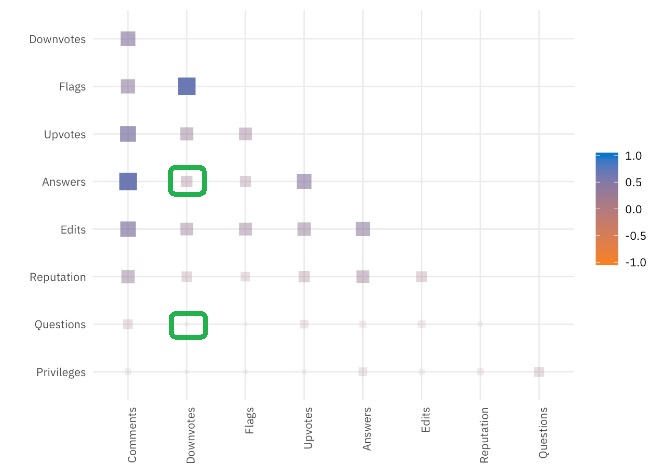
This month, let's look at one plot that is part of a big, multi-team project focused on improving how users learn about our community and its norms. This plot looks at how actions that users take are correlated.
This is a correlation plot. The values shown here are the Pearson correlation coefficient which can range from 1 (two values are perfectly correlated) to -1 (two values are perfectly anti-correlated). The size and color of the squares correspond to the correlation. The Privileges feature measures how many new privileges the user earned in the time period (which was a recent few months), and the Reputation feature measures user rep at the beginning of the time period. Notice a few things:
- There is almost no orange. Users on Stack Overflow are either active doing lots of things, or not.
- Many of the squares are very small and transparent; these correlations are near zero and there are not strong relationships either way for those.
- The strongest relationships we see are between flags and downvotes, and between comments and answers. Users who flag a lot also tend to downvote, and users who comment also tend to write answers.
- Users with higher reputation tend to write more answers and comments.
We can use relationships like these to understand who is using our site and in what ways, so we can build, for example, better guidance for users earning new privileges. That's this month's bite-size data science time! Thoughts? Do you have topic ideas for more data science time adventures?


