35

I am not happy with the top bar.

I get that one of the major goals is to increase traffic to the Jobs and Documentation areas, but that should not happen at the cost of answer quality.

People who answer questions a lot, use the inbox frequently. It is the best part to check comments of others and modify your answers accordingly or write a comment in response.

Moving the inbox way out to the right, lessens the visibility and reduces the chance that one will see a comment response. Also, the area for the inbox is reduced, but that might be OK, if it is in the left area of the screen.

I understand that this issue is faced by only 5% of your user base, but this 5% is the power users and is vitally important to the continued health of the website.

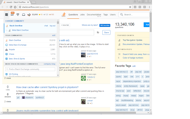
I suggest that an option is provided to move the (reputation + inbox + review queue + other icons on the right) to the left of the Stack Overflow logo. Something like the image below:

suggested revised top bar layout

This solves both issues, the normal user will have the default nav bar and the power user will find the setting to change as per his/her convenience.

11
  • 1
    I can't say if I like the new bar or not. It seems okay, even with the right-hand user area. I find myself able to look there as easily as to the left. The problem I have is adjusting to the collapse of header into one line. I move between SE sites a lot, and every time I land here I have to pause and regroup before I'm ready to engage with the page. Converting more of the sites to a similar layout would help immensely. The beta sites should be easy to switch, as they have no customizations yet, and they are expected to be in flux anyway. Just my 2¢.
    – Chindraba
    Commented Feb 20, 2017 at 8:28
  • 2
    Actually the right corner is out of your eyeline. One has to make an effort to look there. Commented Feb 20, 2017 at 11:00
  • @GypsySpellweaver From what I understand, they're rolling out the new nav to all the other sites sometime in the next 6-8 weeks; I think it's part of a big update with multiple things that they're using Stack Overflow as a sort of final beta test for.
    – Nic
    Commented Feb 21, 2017 at 3:29
  • I support this. (a) It is generally accepted that the search box should be at top right. (b) The current design doesn't work at all with iPads: when you zoom in to enlarge the text, even slightly, these buttons disappear.
    – user207421
    Commented Feb 21, 2017 at 3:43
  • 1
    The search box should be in the right corner. That's just an established pattern.
    – j08691
    Commented Feb 21, 2017 at 3:44
  • @QPaysTaxes Then I suppose this question/discussion is even more important as a feedback to the developers. Returning to a common layout would be nice. Back to the subject, I'm inclined to think that the left corner, even if "out of eyeline" is probably better. Any notification there isn't likely to get instant attention anyway, and forming the habit of glancing there shouldn't be too hard. Anything in my inbox is not life-changing, rep even less so, and I'll finish reading the page I'm on, and/or type my reply, before I bother with the notices. The site menu button, however does seem "wonky".
    – Chindraba
    Commented Feb 21, 2017 at 3:56
  • @EJP I see the same thing you do on iPad, but on the iPod (smaller by far) they have a totally different layout. This looks like a need for modification needed to the responsive design. In portrait mode the text on iPad is too small for my ancient eyes and zooming is needed. For mobiles the search box should be top-right, and a menu button should be top-left. And, since it resembles the mobile "hamburger" menu, intentionally or not, even on the desktop the menu button feels like it belongs in top-left corner. As for the search, seems to be trending to have it be a button like the menu is.
    – Chindraba
    Commented Feb 21, 2017 at 4:08
  • I'd only move the inbox and the achievements to the left, and leave the rest as is. More specifically, I'd like the review queues and SE icons to be far away from the two important ones. Commented Feb 21, 2017 at 14:58
  • Agreed. The first thing to get covered up or scrolled off in a LTR world ought not be My Stuff. Commented Feb 21, 2017 at 21:02
  • Do you mean something like this
    – Makyen Mod
    Commented Feb 22, 2017 at 10:00
  • Same here. I barely notice the inbox and reputation notifications on SO. I usually only notice them if I go over to dba.stackexchange.com which still has them where I see them immediately even when just browsing the questions.
    – user330315
    Commented Feb 22, 2017 at 20:52

1 Answer 1

17

Travis I made a free chrome extension for the reordering of the top bar.

enter image description here

You can get it here: https://chrome.google.com/webstore/detail/stacktopreorder/ghakoiegoehkphelnkokdicepdhmbbhg?utm_source=chrome-app-launcher-info-dialog

or in dark if you prefer: https://chrome.google.com/webstore/detail/stacktopreorder-dark/ppgoflegiopoekoiholkhgmfdbjocibk

Or you can remix it, copy it, do whatever with it from github: https://github.com/travisjj/StackTopReorder

15
  • 7
    You're not Travis I, you're Travis J!
    – Nic
    Commented Feb 21, 2017 at 3:29
  • Given that SO's admins are reluctant to make the change, This extension will do the trick. Here's hoping that it will work for at least a few months. Commented Feb 21, 2017 at 8:17
  • 3
    If you don't mind, please post the source. Since it's just a userscript inside the extension, people with other browsers can use it too.
    – user247702
    Commented Feb 21, 2017 at 8:59
  • I haven't tried other browsers, but in Firefox I also had to add a GM_addStyle(".so-header .-actions { margin-left: 0 !important; }") in addition to the existing CSS line from your extension.
    – user247702
    Commented Feb 21, 2017 at 9:14
  • 2
    I see what you did there with those first two words. Subtle.
    – Mark Amery
    Commented Feb 21, 2017 at 15:22
  • 1
    @Stijn - See edit :)
    – Travis J
    Commented Feb 21, 2017 at 19:18
  • This is excellent. A black background version would be more excellent. Thanks Commented Feb 21, 2017 at 21:04
  • @RishikeshRaje It's not that they're reluctant, it's that it reverts one of the major findings of their tests, which is that the search box is used way more often when it's in the middle of the top bar compared to when it is on the far right side. Their goal in moving to the center was specifically to increase the usage of it.
    – TylerH
    Commented Feb 21, 2017 at 21:08
  • 1
    The blog doesn't indicate "way more" though. In fact, the first month long statistics indicated a drop in search by 13%, whereas the next round only showed an 8% increase. In my opinion this could be sampling error, and is probably within the range of standard deviation for these types of tests. As a result, I do not see conclusive evidence to support the ordering of the search box, and strongly believe that sticking the top bar was the primary reason for increased activity observed in the links.
    – Travis J
    Commented Feb 21, 2017 at 21:41
  • 1
    @TravisJ Agreed. In any case I rarely use Search, wherever it is placed. I already know what I'm looking for ;-)
    – user207421
    Commented Feb 21, 2017 at 23:11
  • @plutonix - See edits :)
    – Travis J
    Commented Feb 22, 2017 at 0:56
  • 1
    Now it is MOAR PERFECT! Thanks. I was using some nice Stylish things that returned the dark nav bar, but after suffering with the new thing a while I realized how much I missed having the personal stuff on the Left. Thanks again Commented Feb 22, 2017 at 1:24
  • @TylerH - If you see the primary goals in the blog post stackoverflow.blog/2017/02/… 3 of these goals have to do with increasing traffic/ discovery/ access to new features. The new features being jobs and documentation. One goal is a updated visual design, which they have achieved. If your goal is to increase traffic to jobs and documentation, this design delivers well on those goals. My issue is that, it has affected the user experience in other ways, which maybe was not tested or checked for. Commented Feb 22, 2017 at 4:47
  • @Stijn: How does the full converted user.js for Greasemonkiey does look like?
    – testing
    Commented Feb 22, 2017 at 11:34
  • 1
    @testing gist.github.com/stijnherreman/8c4ba734acf15393d73c408c79831dfc it's just // @grant GM_addStyle added and the CSS at the bottom with GM_addStyle, rest is the same
    – user247702
    Commented Feb 22, 2017 at 11:58

You must log in to answer this question.

Not the answer you're looking for? Browse other questions tagged .