Update
I think I've changed my mind. It is not that bad.
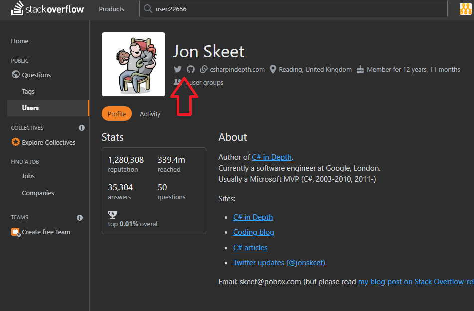
With the new layout of the profile page, the GitHub and Twitter icons are so small and occupy just a tiny space which makes them hard to find and click.
I think they should be accompanied with a text or have a little more margin from each other.
