edited title
Link

Allow experienced users to skip the condescending "New question"Question" UI

deleted 605 characters in body
Source Link

I have over 1K questions on SE/SOF family so might not want to see the extra fanfare of the newish design (as of 9/26/19) that seems directed towards new users:
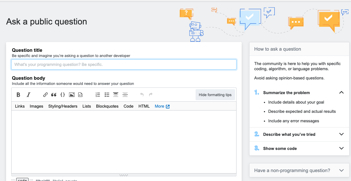
enter image description here Is it possible to see the more streamlined interface that we had until yesterday?

Update In response to a question about "what is the extra fanfare": The entire top bar is higher now /takes more space - to make space for the robot and those question balloons. In addition the entire right hand nav area explaining how to ask a question: that is a big waste of real estate for experienced users. The screen real estate is no longer dedicated to the content of the question being entered.

Another update (11 days later). Asking a question now feels like being transported to nursery school.

Another update (6 months later) Well this request has been gathering dust. I would note: the UI could really use a fix in the following way:

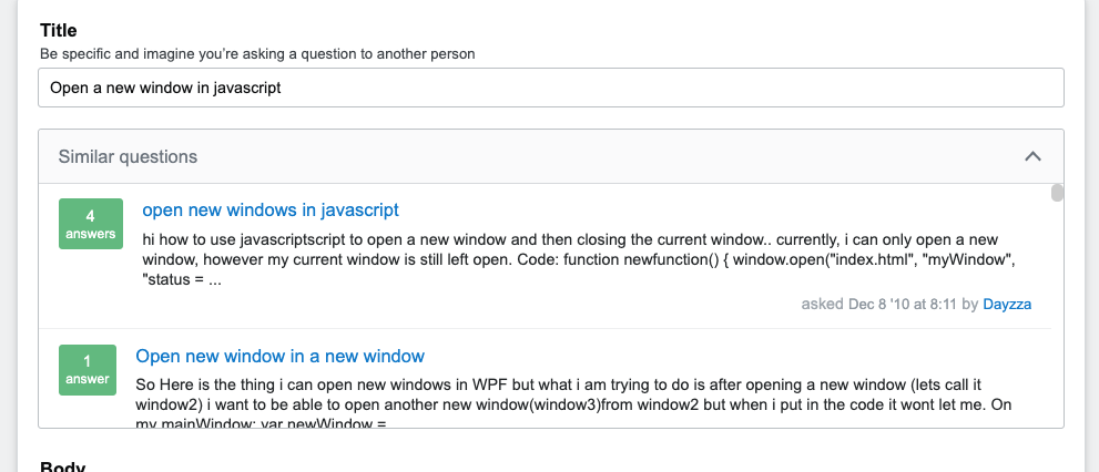
There is insufficient space provided to review the existing questions. I made up a new Question that is obviously already answered.

enter image description here

Notice that only two of the (many) related answers fit here. Providing more space to view more existing questions would be a better use of screen real estate (and designer efforts..) than that robot with the answer balloons..

I have over 1K questions on SE/SOF family so might not want to see the extra fanfare of the newish design (as of 9/26/19) that seems directed towards new users:

enter image description here Is it possible to see the more streamlined interface that we had until yesterday?

Update In response to a question about "what is the extra fanfare": The entire top bar is higher now /takes more space - to make space for the robot and those question balloons. In addition the entire right hand nav area explaining how to ask a question: that is a big waste of real estate for experienced users. The screen real estate is no longer dedicated to the content of the question being entered.

Another update (11 days later). Asking a question now feels like being transported to nursery school.

edited title
Source Link

I have over 1K questions on SE/SOF family so might not want to see the extra fanfare of the newish design (as of 9/26/19) that seems directed towards new users:

enter image description here Is it possible to see the more streamlined interface that we had until yesterday?

Update In response to a question about "what is the extra fanfare": The entire top bar is higher now /takes more space - to make space for the robot and those question balloons. In addition the entire right hand nav area explaining how to ask a question: that is a big waste of real estate for experienced users. The screen real estate is no longer dedicated to the content of the question being entered.

Another update (11 days later). Asking a question now feels like being transported to nursery school.

Another update (6 months later) Well this request has been gathering dust. I would note: the UI could really use a fix in the following way:

There is insufficient space provided to review the existing questions. I made up a new Question that is obviously already answered.

enter image description here

Notice that only two of the (many) related answers fit here. Providing more space to view more existing questions would be a better use of screen real estate (and designer efforts..) than that robot with the answer balloons..

I have over 1K questions on SE/SOF family so might not want to see the extra fanfare of the newish design (as of 9/26/19) that seems directed towards new users:

enter image description here Is it possible to see the more streamlined interface that we had until yesterday?

Update In response to a question about "what is the extra fanfare": The entire top bar is higher now /takes more space - to make space for the robot and those question balloons. In addition the entire right hand nav area explaining how to ask a question: that is a big waste of real estate for experienced users. The screen real estate is no longer dedicated to the content of the question being entered.

Another update (11 days later). Asking a question now feels like being transported to nursery school.

Another update (6 months later) Well this request has been gathering dust. I would note: the UI could really use a fix in the following way:

There is insufficient space provided to review the existing questions. I made up a new Question that is obviously already answered.

enter image description here

Notice that only two of the (many) related answers fit here. Providing more space to view more existing questions would be a better use of screen real estate (and designer efforts..) than that robot with the answer balloons..

edited title
Link
Loading
Bumped by Community user
added 106 characters in body
Source Link
Loading
added 415 characters in body
Source Link
Loading
edited tags
Link
Loading
added 3 characters in body
Source Link
Loading
Source Link
Loading