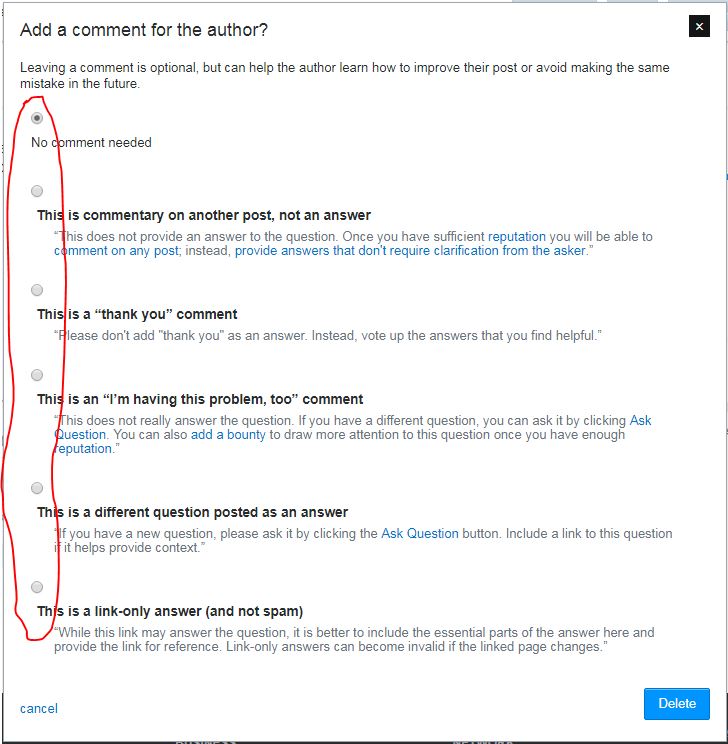
I saw that the radios for the Close reasons was fixed today. However, now I'm seeing a huge misalignment on the Low Quality Posts Delete reasons popup. I don't know if they're related, but I thought I should point it out.
Using Chrome Dev Tools, it looks like it's the display: block; in .action-list:not(.popup-condensed) li>label, which is applied to the label and description text for the delete reason.
FWIW this is happening on the Suggested Edit Reject reason as well
