40

Upon visiting a question page, there are usually links that lead to information related the question, such as a jsFiddle:

After visiting the link, it's color changes in a way that it's nearly impossible to tell it apart from the rest of the question:

enter image description here

It's particularly hard when the question consists of big blocks of text. If it really needs to be indicated that the link was already visited, I believe it should be indicated in a way that it's still easy enough to tell the link and the text apart.

4
  • 2
    Visited links should be more visible (MSE) "This is mainly for Stack Overflow... But a similar issue has been raised for beta sites."
    – gnat
    Commented Aug 22, 2014 at 13:51
  • 2
    I also asked a similar question on Gamedev, but it didn't quite attract the attention I was hoping it would. I would really prefer if unclicked links were much darker, and clicked links were as light as the unclicked links are now.
    – kurtzbot
    Commented Aug 22, 2014 at 18:46
  • I said this on a related post, but what is the reason that are there underlines on meta and not the main site? Maybe to not draw as much attention to the links?
    – gunr2171
    Commented Sep 23, 2014 at 12:41
  • 3
    I guess status-completed with the new design?
    – hichris123
    Commented Apr 3, 2015 at 21:32

2 Answers 2

13

So what about adding underlines, like we do on meta?

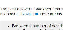
Let's take an example from this c# answer. The default "unvisited" looks like:
enter image description here

It's bright, it's clear. Great.

But of course, when you click it, the link more-or-less "disappears" into the post. If you manage to find the link, there is an underline on the hover action. The only explanation I can think of is "well you have already been to that link, so no need to tell you again and shift attention from the rest of the content".

So why not keep the colors but add an underline? I added the styles I found on this meta site to that answer.

.post-text a {
    border-bottom: 1px #444 dotted
}

enter image description here

For reference, here is how the whole post looks with the style:

enter image description here

It's clear that you have visited the link already, it does not draw too much attention to itself, and you can easily find it from a wall of text.

Someone would have to do some UX testing on if the underlines should only be on unvisited links, or both. Also the bottom-border conflicts with the hover's actual underline, so the devs need to do one or the other.

2
1

Usability guidelines state that visited links should be distinguished from unvisited links.

I can't see why visited links are not just purple and unvisited links blue, which is the default setting.

Here is an excerpt from Jakob Nielsen's usability recommendation on link colours:

The color for unvisited links should be more vivid, bright, and saturated than the color for visited links, which should look "used" (dull and washed out). The two colors should be variants or shades of the same color, so that they're clearly related. Using drastically different colors (say, orange and green) makes it hard for users to understand the relationship between the two types of links and to identify which color is the "used" version of the other. Shades of blue provide the strongest signal for links, but other colors work almost as well. As always, when using color to signal information, you should provide redundant cues for color-blind users. Making unvisited links brighter and more luminous than visited links will usually accomplish this goal.

The problem I am having with the current setup is that when I search for an answer on Stack Overflow, I can't tell which questions & answers I have already read:

Visited links are not distinguished from unvisited ones

You must log in to answer this question.

Not the answer you're looking for? Browse other questions tagged .