I was going to request this, so I'm posting what I have as an answer here. I put a lot of effort into putting it all together, and I think it illustrates why this is such a problem.
The thing about the suggested edits queue is that, unlike all the other "mixed" queues, it is very unclear what the post is exactly.
Here are some pictures of the first posts queue:


I haven't labeled them, but it should be obvious enough what they are.
Here are some pictures from the suggested edits queue:
Can somebody explain why this answer has tags? Or is it an accepted question? (It's really hard to tell if it's a question or an answer when it's not accepted.)

And here is a post without a bold title. Can somebody explain to me why the supposed "asker" does not appear to own the post? Their name is white, not blue:

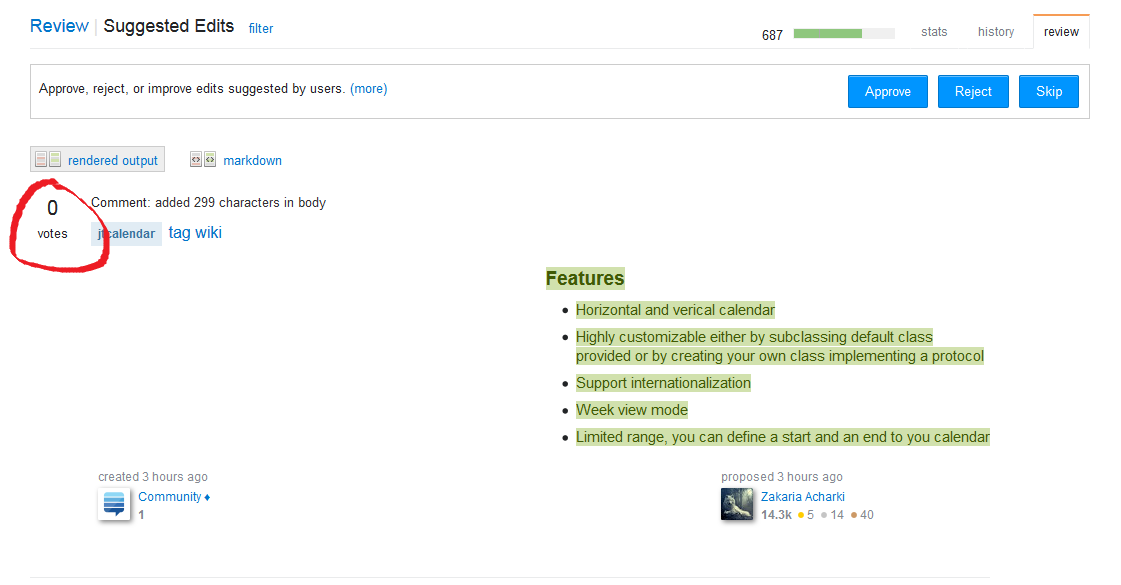
I stole this picture from another question, but it shows that tag edits are also a little confusing. Why is there a vote count? It makes it look like a question/answer:

The other thing I'm realizing is that editing an edit also has poor UI. While there are a few indications (the ability to edit title & tags), it would be helpful to have the word "question" (or "answer" or "tag wiki") as a bold heading. And we also should get a link back to the original post, since I see nothing currently:

Essentially, I think we should:
- Add a bold header (like FP) indicating what you're reviewing (Question, answer, tag wiki)
- For questions, highlight the ownership with blue
- For answers, include the question below it. It could either be like FP/LQP or it could be more like a one-box.
- It might work to include the tags under the question
- When editing in the queue, specify type of post is being edited. In case I forgot or something.
- Add a link to the post when you are editing in the queue. OK, not entirely relevant, but I thought I might as well mention it while I'm redesigning the UI.


