89

I have been going through a couple of pages of https://userstyles.org, but I didn't find yet what I am looking for.

Does anybody have a way to make Stack Overflow more readable? By "more readable", I mean basically like Stack Overflow was before the latest tweaking of the layouts. Something like a user style thing would be nice, but if somebody has some other solution which is persistent I would be OK with that too.

18
  • 9
    Readable in what regard? What "layout tweaks" are bothering you specifically? Commented Jan 17, 2015 at 14:05
  • 27
    I wouldn't say it's unreadable.....it's merely difficult to read and gives me a headache when I force myself to read it.
    – Danack
    Commented Jan 17, 2015 at 14:06
  • 45
    @PatrickRoberts The lighter title fonts for one. It's a real pain to try to read it. But if somebody has a almost complete revert of SO I would be pretty happy.
    – PeeHaa
    Commented Jan 17, 2015 at 14:07
  • 1
    If someone could post a link to a google cache of older SO pages with their original fonts and styles in the comment section here, or you could add a link in your question, I'm sure somebody could eventually use that to make a satisfactory userstyle. Commented Jan 17, 2015 at 14:10
  • 19
    I find the way you phrased your question rather impolite. After all, what you really are asking for is a user style of the old SO layout. I don't think many people agree with you that they are unreadable (you may not like them, but this is another thing) and it seems to be just passive-aggressive against the new layout.
    – dirkk
    Commented Jan 17, 2015 at 14:47
  • 33
    @dirkk, there's so many issues reported around (font sizing on many places makes reading really difficult), so isn't that you who has quite a low sense of quality? Compare e.g. this with this? Which one would you choose? And I could bring you tens of others... The new style makes SO worse readable than before.
    – TLama
    Commented Jan 17, 2015 at 15:00
  • 4
    @dirkk What is impolite about the question exactly?
    – PeeHaa
    Commented Jan 17, 2015 at 15:12
  • 2
    You can get something going from here
    – rene
    Commented Jan 17, 2015 at 15:18
  • 5
    @PeeHaa Saying they are "unreadable" basically says the SO designers are completely incompetent (and is also incorrect, as I guess you can still read it, even if it is worse than before). It is another thing if you would have said "less readable" (I have no opinion to that, they are both the same to me in terms of readability), which is also more correct I guess.
    – dirkk
    Commented Jan 18, 2015 at 0:22
  • 1
    @TLama (and @Paul) I didn't argue whether the new style is better or worse and I didn't say a single thing about the quality of something. As you said, it might be less readable, but my point is that it definitely isn't unreadable. I simply have no opinion on the readability, personally I can read both fonts equally good.
    – dirkk
    Commented Jan 18, 2015 at 0:26
  • 5
    @PaulCrovella I never said someone insulted anyone here and you seem to read this into my comment (also, I am pretty chilled). I simply said the way it is phrased is rather impolite and there would have been many ways to phrase it in a nicer way.
    – dirkk
    Commented Jan 18, 2015 at 11:47
  • 29
    WHO MOVED MY CHEESE?!
    – Robert Harvey Mod
    Commented Jan 18, 2015 at 22:50
  • 4
    @dirkk It seems like you're just arguing semantics here. Commented Jan 19, 2015 at 18:55
  • 5
    I can't see why you've got on your high horse here @dirkk, it's not passive aggressive at all. A website's design is in place for the users of it, plain and simple. If the users have complaints about how it makes consuming the information less efficient as before, then those complaints are perfectly legitimate. It's not up to you to try and shoot them down. He hasn't said the designers are completely incompetent, but in this case - they haven't done the best job, get over it. The OP isn't even requesting a design change for everyone, he's asking for a way he can solve it for himself.
    – user1017882
    Commented Jan 20, 2015 at 8:51
  • 6
    If it ain't broke, don't fix it. If was fine before. No mods were necessary - SExchange selling out again.
    – Vector
    Commented Jan 20, 2015 at 11:27

2 Answers 2

80

For the people who agree the new layout changes are much less readable and want to use a user style to fix this situation we (read Paul Crovella) have started work on a user style:

Current status

Not sure how far I want to take this, but I will probably fix some more things in here. If you want to fix something yourself feel free to PR your changes on GitHub.

CSS

/**
 * General.
 */

/* font settings */
body {
    font-family : Arial, "Liberation Sans", "DejaVu Sans", sans-serif !important;
}

/* Tags. */
.post-tag {
    border-bottom-color : rgb(179, 206, 225) !important;
    border-right-color  : rgb(179, 206, 225) !important;
}

/* Buttons. */
input[type=submit], input[type=button], .button, a.button:link, a.button:visited, .btn {
    background-color : #444444 !important;
    border-color     : #222222 !important;
}

/**
 * Question list.
 */

/* Title links. */
h3 > a, .result-link a {
    font-family : 'Trebuchet MS', 'Liberation Sans', 'DejaVu Sans', sans-serif !important;
    font-size   : 17px !important;
    font-weight : bold !important;
}

/* Votes, answers, views. */
div.cp {
    font-family : Arial, 'Liberation Sans', 'DejaVu Sans', sans-serif !important;
}

.votes, .status, .views {
    font-size   : 13px !important;
    font-weight : normal !important;
}

div.cp > .status {
    width : 48px !important;
}

div.cp .mini-counts {
    font-size   : 20px !important;
    font-weight : normal !important;
}

/**
 * Question page.
 */

/* Share, edit, close, flag link separator. */
.lsep {
    color      : #cccccc !important;
    font-size  : 110% !important;
    visibility : visible !important;
}

/* Question header. Duh. */
#question-header {
    padding : 0 !important;
}

#question-header h1 {
    margin-bottom : 7px !important;
}

/* Code. */
code {
    font-size : 14px !important;
}

h1 code, h2 code, h3 code {
    font-size : 0.9em !important;
}

.comment-copy code {
    font-size : inherit !important;
}
14
  • 36
    !important everything! Commented Jan 17, 2015 at 15:50
  • 15
    Many thanks! Having some contrast again is sooooo much better!
    – charlietfl
    Commented Jan 18, 2015 at 23:57
  • 8
    Cheers fella, have a beer on me, my eyes have stopped bleeding again! Commented Jan 19, 2015 at 19:17
  • 10
    Oh, how I wish we could award bounty points on Meta. Sooooo much nicer.
    – Tieson T.
    Commented Jan 19, 2015 at 19:29
  • 2
    A thousand thanks from my eyes. Thank you, thank you. Commented Jan 20, 2015 at 7:09
  • Why is everything !important? Shouldn't user styles override site styles by default?
    – Rawling
    Commented Jan 20, 2015 at 9:51
  • 6
    @Rawling Nope. User styles are not much more than an injected stylesheet. Normal rules apply.
    – PeeHaa
    Commented Jan 20, 2015 at 9:57
  • 2
    @PeeHaa Huh, you're right, it's user < author < author important < user important. I always thought the unimportant ones were the other way around. Ta!
    – Rawling
    Commented Jan 20, 2015 at 10:03
  • Considered making a Dark Theme for SO in the process?
    – juergen d
    Commented Jan 21, 2015 at 13:01
  • 3
    @juergend I don't think that is within the scope of this user styles script.
    – PeeHaa
    Commented Jan 21, 2015 at 16:37
  • 4
    So much better on high-res screens. Now if only it was possible to sneak in .question-summary { transform: rotate(-179deg); } just for facebook questions, :) ha. @juergend There were a few already, github.com/StylishThemes/StackOverflow-Dark, but needs the little update too.
    – mario
    Commented Jan 21, 2015 at 23:47
  • PeeHaa and others, do you mind if I ask what platform and browser you're all using? I wonder if this is a platform specific thing. Using Chrome on a Mac I don't find the site hard to read at all, and using your stylesheet just makes fonts seem hilariously huge. Is there a chance that this is your OS not doing a great job of rendering smaller fonts?
    – user229044 Mod
    Commented Apr 15, 2016 at 12:55
  • 1
    The old style and the new style. Windows 7/Chrome (both canary as well as stable). You can blame Windows for a lot of things, but I doubt the use of thin fonts on Windows (by designers / template tweakers / hipsters) is related in this case.
    – PeeHaa
    Commented Apr 15, 2016 at 13:17
  • @meagar In the new style the blue links are too pale, this was reported not once and I totally agree, the same is for hyperlinks in text, they all shoud be darker.
    – Mikhail V
    Commented Apr 17, 2016 at 22:19
6

Here I present a user style for the Stylish plugin I've created recently - "GreenGray". I must say, SE has a very large CSS, but finally I've understood the needed bits, mostly by trial-and-error.
Main idea is exactly to make the site as readable as possible. I read SE a lot, so readability counts for me in the first place.

Source on Github

https://github.com/Mikhail22/Stackoveflow_CSS_Stylish

Example (on 1280 px wide window)
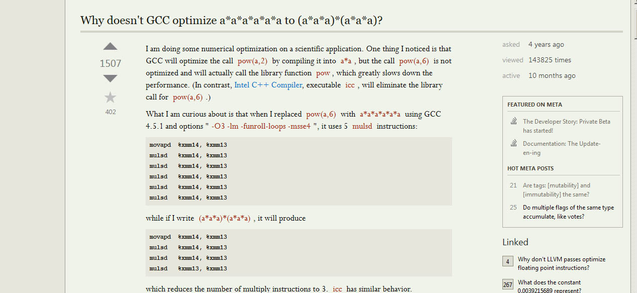
enter image description here

What is changed

Here are main changes to the site which improve my reading experience:

  1. Serifed fonts with correct line spacing and background colors.
  2. Makes the page layout more center-oriented, so now it is much more comfortable for the eyes. Also it makes the layout to absolute positioning instead of floating.
  3. Makes the sidebar smaller and moves it further to the right.
  4. Some other minor fixes, e.g. vertical spacing in lists, reduced coloring.

Requirements

This scheme is currently made only for Firefox/Windows. The only requirement is having the font named "Perpetua" on Windows. AFAIK "Perpetua" is the only good readable and more or less standard font wich is adopted for screen rendering. It comes together with most MS office programms, but if you don't have this font, then you should get it (google it). Note, when downloading the font somewhere, you'll need 4 .ttf files: Perpetua, Perpetua Bold, Perpetua Italic, Perpetua Bold Italic.

Other fonts used are "Segoe UI", "Georgia" and "Courier New" (must be in Windows by default) When this scheme will become permanent I'll release also a Linux version. Note that it is not enough just to add Linux font alternatives in the CSS, all fonts even on the same platform have different metrics, so it must be a separate CSS.

Adjustment

Main improvements you can make:

  • Setup bg color in #content{}
  • Setup bg color in pre{}
  • Experiment with font sizes (depends on monitor DPI)
  • Add bitmap noise to the #content{} background (slows down page loading)

Feedback

If you try this CSS out, please leave a comment!
Note, I am not a CSS pro, I believe someone more proficient in CSS programming and better knowledge of SE's CSS can make improvements to this.

You must log in to answer this question.

Not the answer you're looking for? Browse other questions tagged .