347

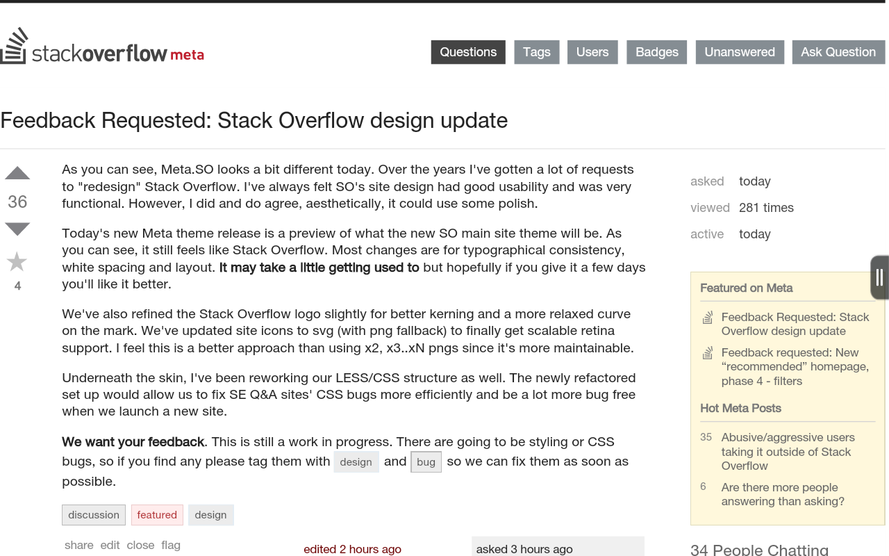
As you can see, Meta.SO looks a bit different today. Over the years I've gotten a lot of requests to "redesign" Stack Overflow. I've always felt SO's site design had good usability and was very functional. However, I did and do agree, aesthetically, it could use some polish.

Today's new Meta theme release is a preview of what the new SO main site theme will be. As you can see, it still feels like Stack Overflow. Most changes are for typographical consistency, white spacing and layout. It may take a little getting used to but hopefully if you give it a few days you'll like it better.

We've also refined the Stack Overflow logo slightly for better kerning and a more relaxed curve on the mark. We've updated site icons to svg (with png fallback) to finally get scalable retina support. I feel this is a better approach than using x2, x3..xN pngs since it's more maintainable.

Underneath the skin, I've been reworking our LESS/CSS structure as well. The newly refactored set up would allow us to fix SE Q&A sites' CSS bugs more efficiently and be a lot more bug free when we launch a new site.

We want your feedback. This is still a work in progress. There are going to be styling or CSS bugs, so if you find any please tag them with and so we can fix them as soon as possible.

77
  • 161
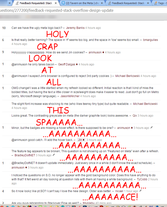
    Can we have the ugly meta logo back? Commented Nov 19, 2014 at 1:21
  • 83
    Is that really better kerning? The space in 'rf' seems too big, and the space in 'low' seems too small.
    – bmargulies
    Commented Nov 19, 2014 at 1:25
  • 18
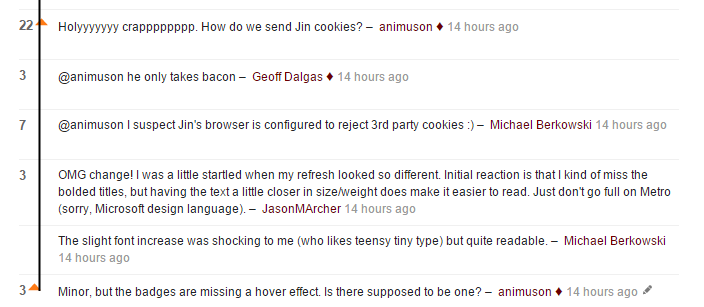
    OMG change! I was a little startled when my refresh looked so different. Initial reaction is that I kind of miss the bolded titles, but having the text a little closer in size/weight does make it easier to read. Just don't go full on Metro (sorry, Microsoft design language). Commented Nov 19, 2014 at 1:28
  • 12
    Minor, but the badges are missing a hover effect. Is there supposed to be one?
    – animuson StaffMod
    Commented Nov 19, 2014 at 1:38
  • 11
    So it now lookz like pt.SO? I can't say I love the new design. Older was better.
    – nicael
    Commented Nov 19, 2014 at 4:23
  • 34
    Are you guys rebranding to Stackover Flow as well?
    – tmyklebu
    Commented Nov 19, 2014 at 4:53
  • 53
    Suggestion for site background: i.snag.gy/AOKxV.jpg
    – Jason C
    Commented Nov 19, 2014 at 6:37
  • 14
    previous logo was better i think..
    – Haris
    Commented Nov 19, 2014 at 8:59
  • 37
    Bog standard Courier for code, yuck. The main site uses Consolas, which is much better.
    – Jongware
    Commented Nov 19, 2014 at 11:29
  • 26
    it's so hard to read the comments. Could you increase the text font size? Commented Nov 19, 2014 at 12:03
  • 44
    When users upvoted comments the number beside it turned redder the higher it was. Was this feature scrapped?
    – TNT
    Commented Nov 19, 2014 at 13:55
  • 13
    Maybe my eyes are tired after a long day at the keyboard, or maybe it's just psychosomatic but... The comment font seems worse, maybe it's a different size or font or the anti-aliasing is different, but it definitely seems less readable.
    – Klors
    Commented Nov 19, 2014 at 18:31
  • 13
    Can I assume this just went live on SO? Commented Jan 16, 2015 at 2:59
  • 16
    Why did this go live on SO when there were apparently still so many issues (which didn’t get fixed on SO)? Also, can we get a new question to discuss this since this one is old and so overused already? It’s hard to navigate.
    – poke
    Commented Jan 16, 2015 at 7:06
  • 16
    I'll let my eyes speak: Pre update they didn't hurt, now they hurt when trying to read through the front page. Yes I am serious and I think it's a big issue.
    – Jite
    Commented Jan 16, 2015 at 13:54

85 Answers 85

326

I actually really like this.

My only "complaints" are:

  1. I can't tell what's a link (I wish you guys would just start underlining them).
  2. It looks too close to SO (maybe a slightly darker, cozier background?)
  3. Biggest one: There is way too much whitespace between one-line comments:

screenshot

23
  • 28
    +1 it makes me think "SO tried to hard to have a nice narrow menu, but just a few comments that fit on one line will add a lot of empty space, seems pretty inconsistent to me!". Next step: add a big banner to the menu! haha
    – Adriano
    Commented Nov 19, 2014 at 9:41
  • 52
    The space is there to make room for the flag button. Commented Nov 19, 2014 at 14:07
  • 3
    @TheGuywithTheHat Yeah, but something about the font or something else on the page makes it look really big, I think. I can't put my finger on it.
    – Jason C
    Commented Nov 19, 2014 at 14:12
  • 2
    The comment font is apparently slightly smaller now, but we might as well make it larger again if we're going to have that much whitespace between comments. Commented Nov 19, 2014 at 15:30
  • 7
    The Guy with The Hat is right about the flag icon. That could fly off to the left, or overlay the text with a white background... I'd prefer either of those to the extra spaaaaace. Commented Nov 19, 2014 at 15:37
  • I have always wanted to see the flag icons be next to the vote icons, but I didn't want to mention it in the post because it's more of a separate feature request than a comment on the design change (the flag / vote icon layout isn't unique to SO meta or part of this change).
    – Jason C
    Commented Nov 19, 2014 at 16:07
  • @TheGuywithTheHat Flags are on the left, not underneath.
    – TylerH
    Commented Nov 19, 2014 at 16:40
  • 2
    @TylerH They are to the left, but they are also lower than the bottom of one-line comments, i.e. below the comment. You can see that your own comment—which you can't flag or upvote—only takes up one line. Commented Nov 19, 2014 at 16:56
  • 22
    Spaaaaaaaace!
    – Machavity Mod
    Commented Nov 19, 2014 at 17:06
  • 3
    I have made a feature request to move the flag icons next to the vote icons, as well as a user script that does it.
    – Jason C
    Commented Nov 19, 2014 at 21:11
  • 11
    I'm fixing this on dev. I'm increasing comment font size to 13px and adjusted the padding a bit so it matches the spacing as the old meta.
    – Jin Mod
    Commented Nov 19, 2014 at 22:13
  • 33
    +1 for "can't tell whats a link" - I had this problem several times now. Hint: 9% of all men are red-green blind ("weakness" would be a better term, because it's not a "complete" blindness)... It is really hard to distinguish the red color of the link from the other text. I often only find the links on SO by reading the context and guessing that there should be a link... Also thanks for the increase of comment font size, the current one is really hard to read on a 1600*1200px monitor... Pressing Strg+"Plus" increases the comments font size, but the other content gets too big then...
    – mozzbozz
    Commented Nov 20, 2014 at 12:07
  • 3
    @xxbbcc easy for you to say if you're not colour blind
    – Cocowalla
    Commented Nov 23, 2014 at 16:31
  • 2
    @Cocowalla It'd be nice to have options. Links should stand out in more than one way - I'd support something like having a common image in front of the link, or bold links, etc. If underlying could be turned off in profiles, I'd be fine with underlines, too (since I'd just turn them off).
    – xxbbcc
    Commented Nov 23, 2014 at 23:18
  • 1
    The comment gets shorter if you flag it. Mass-flag to get rid of whitespace!
    – clickbait
    Commented Jul 14, 2018 at 17:08
203

Link text is still unreadable on meta. It looks like normal text unless you've visited it. (Hint: This has been a problem for a while; fix it while you're at it!)

The color on SO proper should also be addressed at this point too. It sounds like something trivial, but it's discouraging to link things in answers knowing the OP (and other users) have a high chance of not catching the fact they're links.

Other than that, looks great in my opinion. The sharper contrast in colors looks cleaner and more professional.


EDIT: Good to go :)

13
  • 87
    It's actually harder to read once you've visited it. It's a dark red when unvisited, and turns grey once you've visited. Really hard to tell it's a link.
    – animuson StaffMod
    Commented Nov 19, 2014 at 1:50
  • 24
    you're totally right about the color. I left the link color the same dark maroon color as before for the time being. I'm definitely going to make it more readable in future patches.
    – Jin Mod
    Commented Nov 19, 2014 at 1:51
  • 7
    This also affects username on comment thread. The first time I saw that, I was surprised thinking they were deleted.
    – Andrew T.
    Commented Nov 19, 2014 at 6:27
  • 1
    You can kind of work around the issue by making the links bold. So instead of this they would look like this. Commented Nov 19, 2014 at 7:45
  • 51
    Links should be underlined. Why this fundamental UX fact is ignored so often nowadays is utterly beyond me. Commented Nov 19, 2014 at 13:04
  • 6
    We have this problem on the main site, why bring it to meta as well? I agree that the links should, at a minimum, be underlined.
    – gunr2171
    Commented Nov 19, 2014 at 14:45
  • 23
    @Jin I propose a color-blind friendly text-decoration: underline on links in posts and comments. The rest is pretty obviously clickable (usernames and timestamps, the share, edit, flag buttons, etc). But I think this looks reasonably good while providing a clear UX benefit. i.imgur.com/xNhmPZF.png Commented Nov 19, 2014 at 15:15
  • 13
    I second @SecondRikudo as a colorblind user. WIth the current design update, I honestly cannot tell what's regular text and what's a clickable link. Please either choose another color for links, or add text-decoration to them.
    – MattD
    Commented Nov 19, 2014 at 15:53
  • 5
    Good contrast is important for everyone. Color combinations that may appear sufficiently distinguishable on a designer's expensive, calibrated display may look very different under the variety of conditions experienced in the real world (bad color reproduction, less-than-ideal viewing angles, bright sunlight on mobile devices, etc). Starting with extra contrast increases the chances that the difference will still be noticeable.
    – nobody
    Commented Nov 19, 2014 at 17:34
  • 2
    I am personally a fan of having links underlined with a dashed line. Makes it distinct from underlining for emphasis, but still clear to everybody that there's something different there.
    – Ajean
    Commented Nov 19, 2014 at 19:08
  • @Ajean I like that idea, but I also fear that sucz a link would look like one of those automatic generated context ads found on many pages...
    – Daniel
    Commented Nov 24, 2014 at 15:34
  • 1
    I'm red-green colorblind too, and I actually didn't notice the link in the answer until I saw the screenshot in @Second Rikudo's comment. Commented Nov 25, 2014 at 18:39
  • This should probably be historically locked rather than closed, IMO. Commented Jun 20, 2018 at 17:23
144

Please change the color of the "close" option on the share this post popup:

share popup screenshot


Also, can we please have better alignment of the scores on the answers tab of our profile page?

enter image description here


The highlighted item in the help section needs a new color:

enter image description here


The font size in my flag history is weird:

enter image description here

The font size on the main site flag history is uniform:

enter image description here


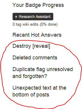
Font size on "Recent Hot Answers" is too big:

enter image description here


Upvoted comments look weird, the number and the arrow/flag icon isn't aligned properly, please fix it.

enter image description here

Alignment with flag:

enter image description here

5
  • 16
    will fix in next build.
    – Jin Mod
    Commented Nov 19, 2014 at 3:30
  • Thanks @Jin, I will keep adding new suggestions in this post as I come across them :) Commented Nov 19, 2014 at 3:41
  • mah, just delete this and post a new one, since Jin love all those ---pings--- messages in the inbox
    – Braiam
    Commented Nov 19, 2014 at 4:43
  • 5
    I explained why the hover effect doesn't work on visited links in my answer. It's only broken for some links though.
    – animuson StaffMod
    Commented Nov 19, 2014 at 5:44
  • 3
    Thanks @animuson, I removed it from my post to reduce redundancy and length. Commented Nov 19, 2014 at 5:47
128

EDIT: No guys, seriously, fix the links. They're getting a bit too difficult to read.

It feels kind of...clean. MSO's got its business suit and tie on, and it's doing its best to impress. But it also feels sterile in some areas. I'm not saying that's a bad thing, but some things are going to definitely need tweaking.

I'm looking exclusively at this page, and I see a handful of oddities. Xubuntu 14.04, Chrome 39.0.2171.62 beta (64-bit).

  • The vote count divider is noticeably wider than what one would be "used" to. Below are the screenshots for reference - on the left is Stack Overflow as it is today. It's also kind of awkward that there's so much more space between it and the vote counts.

enter image description here                  enter image description here

  • Is there any good reason to set the reputation of users as this kind of faded gray? It's the same color you're using for visited links for whatever odd reason.

enter image description here

  • Speaking of links, why not reintroduce the dashed styling for links? I could appreciate that it's borrowing from Meta's theme, but Meta can partially get away with what it's doing because its primary color is blue, not...gray. This issue extends to the revision number below; if you don't have a decent monitor or you can't really distinguish between shades of gray, you're going to have a fun time telling which version MSO is on.

enter image description here enter image description here

  • I just noticed that favorites are bright. This isn't very readable.

enter image description here

4
  • 52
    Can you please put the first images in a blockquote? I clicked on the screenshots to upvote your answer...
    – A.L
    Commented Nov 19, 2014 at 10:08
  • I agree that the yellow color in the favorites falls into the "avoid contrast only in the blue channel" trap.
    – O. Jones
    Commented Nov 19, 2014 at 13:30
  • wait... i only see overall score. is separate upvote/downvote counts something i need to unlock with more reputation? Commented Nov 20, 2014 at 16:49
  • 8
    @Woodrow You require 1k reputation to see vote counts.
    – Makoto
    Commented Nov 20, 2014 at 16:50
86

(Check the revision for fixed bugs)

  1. Vote count overflow in the sidebar [FIXED]

  2. Jon Skeet's problem (preemptive)

    I modified the badge count in the DOM inspector to check whether it has space for high count of badges.

  3. Pagination is located at a weird position [FIXED]

  4. The tags are 1px too close to their description on the tags page. Although it is only 1px, it is enough to cause the impressions that they are closer than they should be.

    Overlay for comparison

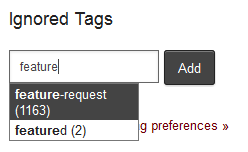
  5. Misaligned drop-down on favorite tag/ignored tag

    The same problem on main site, but the difference is not as striking.

    There are also too much space between "Ignored tags" and the box.

  6. Misaligned vote count in list of posts (e.g. https://meta.stackoverflow.com/tags/design/new)

    There are also too much spaces to the left.

    On the main site, the vote count has a colored background, but the new design make the background white, so the number looks floating.

  7. On home page, the color is not applied to the numbers on questions with high view [FIXED]

  8. On badges page, the check mark is misaligned [FIXED], and the space to the right for the names seems to be lacking [FIXED], causing it to wrap to the next line.

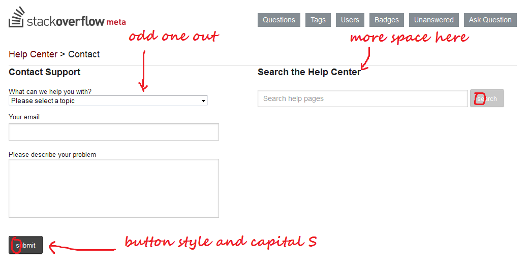
  9. Contact page

  10. Quote starting a post breaks the preview [FIXED]

3
  • 4
    +1 for number 3 (I was actually thinking about posting that issue myself). That bar should be over to the left or right IMO, not floating where it is.
    – user2555451
    Commented Nov 19, 2014 at 17:31
  • 5
    Jon Skeets problem is that he still does not have 1M reputation. This would give more pixels for badges. Commented Nov 20, 2014 at 20:00
  • 8
    SO should definitely offer you a JOB in QA :D Commented Nov 22, 2014 at 15:36
77

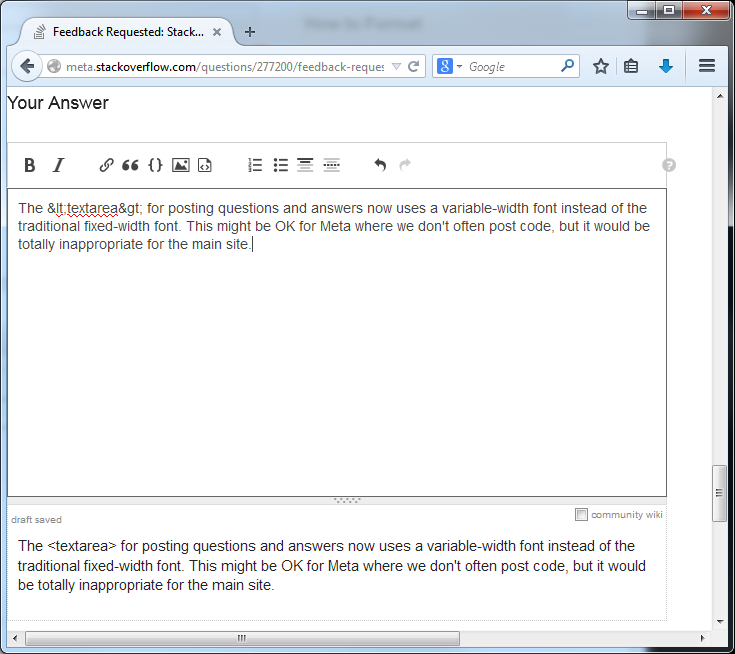
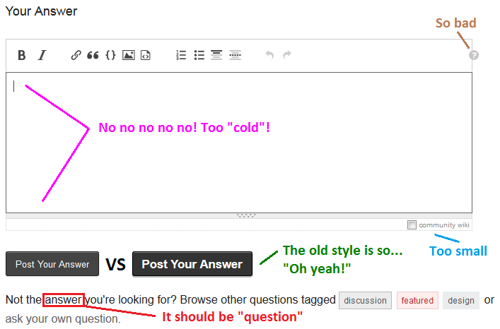
The <textarea> for posting questions and answers now uses a variable-width font instead of the traditional fixed-width font. This might not be the end of the world for Meta where we don't often post code (though I don't like it), but it would be totally inappropriate for the main site.

Screenshot of editor

Please bring back the fixed-width font.

3
  • 5
    The stolen mono-spaced font for the editor is causing me major problems when typing nicely formatted code snippets. I'm now less motivated to give well worked out answers and put lots of effort into them. Quick-shot answers it will be in future (if any at all). SO quality will go down through this (because I'm not the only one loosing motivation when seeing how this change rides roughshod with us and our efforts). Commented Jan 16, 2015 at 4:18
  • 4
    Seriously, this cannot be overstated. As Kurt says, code formatting is much more difficult. But on top of that, ASCII diagrams (which can be incredibly useful in a question/answer) are almost impossible (for a very simple example, this answer is improved with the arrows that highlight the mistake; monospaced text is a must!).
    – Cornstalks
    Commented Jan 16, 2015 at 6:00
  • 5
    Please don't use HTML entities for writing code! Use backticks!!! Commented Jan 16, 2015 at 11:19
58
  1. Can I haz borderz around tag scores?

    With current design, such a look would be very good:

  2. Answers with score <-7 are no longer greyed out. But should be (?)

  3. Beep. Buggy tabs:

    enter image description here

  4. Selected and non-selected stars have slightly different designs. Also, text (number of starrers) under selected star is normal, while non-selected star has bold text under it. This text should be also centered to the star.

    enter image description here

  5. Can top bar use a larger resolution of my avatar?

    enter image description here

10
  • 7
    Yes, blue borders please :P Commented Nov 19, 2014 at 5:35
  • Those borders looks good! Ad point 2, didn't you mean Answers with score <= -3. Or is this fade-out limit different here on meta ?
    – TLama
    Commented Nov 19, 2014 at 19:49
  • 1
    @TLama <2 on main, <7 on meta, yep :)
    – nicael
    Commented Nov 19, 2014 at 19:53
  • haha point 5, a personal request
    – Joop
    Commented Nov 22, 2014 at 19:53
  • 5
    @Joop Not a personal; this applies for every user.
    – nicael
    Commented Nov 22, 2014 at 20:15
  • @nicael To be fair, it only applies if you zoom right in.
    – AStopher
    Commented Nov 23, 2014 at 11:13
  • 2
    @cyber It can be felt on high-res screens, I am just exaggerating it a bit to let you understand what I mean.
    – nicael
    Commented Nov 23, 2014 at 11:52
  • @nicael but how (and why ;-) ) did you notice that? Commented Apr 21, 2016 at 9:27
  • meta.stackoverflow.com/questions/417215/...
    – nicael
    Commented Apr 5, 2022 at 17:27
  • meta.stackoverflow.com/questions/417215/…
    – nicael
    Commented Apr 5, 2022 at 17:27
49

I like it, especially the black and white look of the icons in the answer-editor.

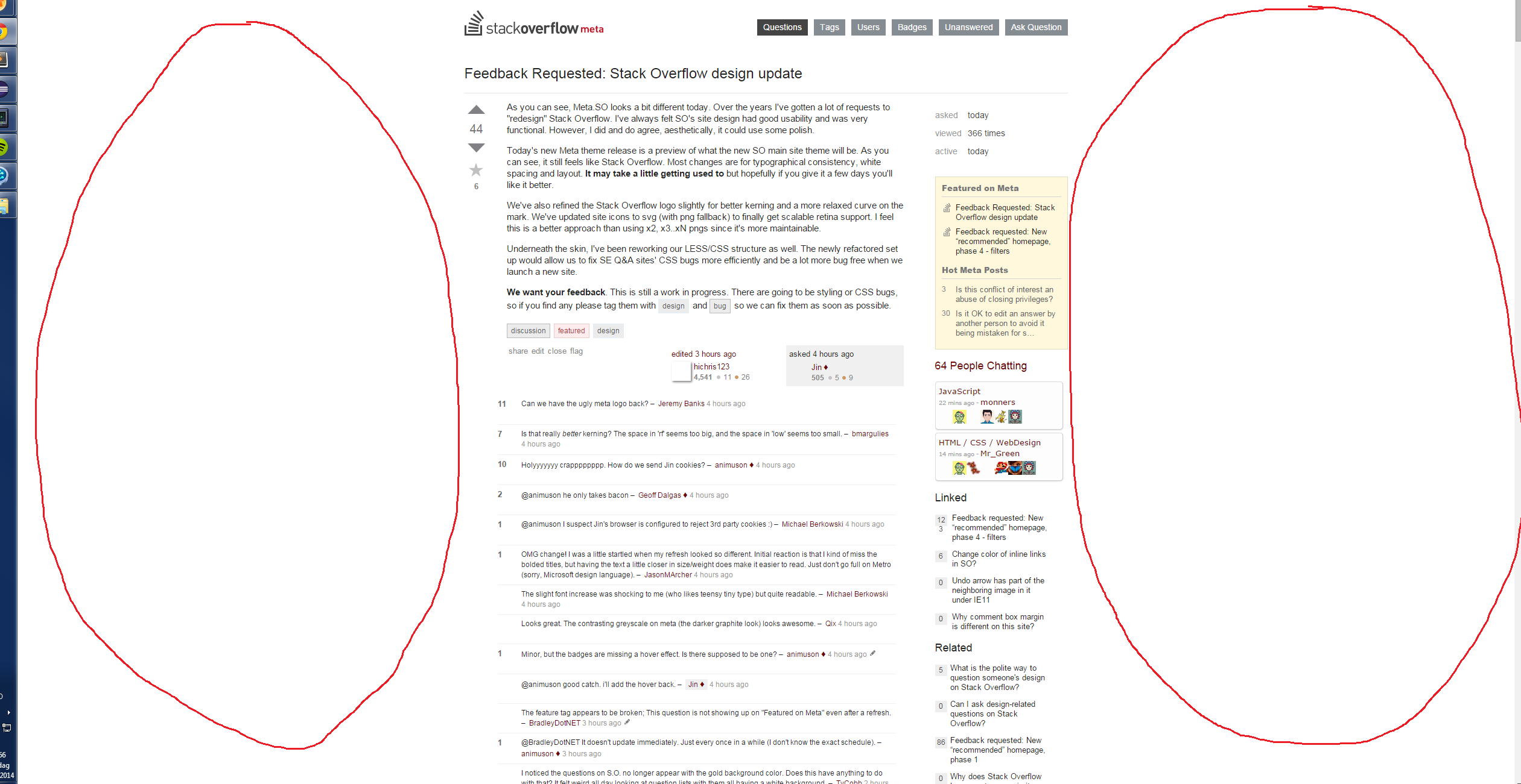
One thing that still irritates me (and I know it's a huge thing to fix) is all the wasted whitespace. I run at 2560x1440 and I run Chrome in fullscreen, so I might notice this even more because of that but still the main column with content is only 728px on my screen.

enter image description here

(Yes, I run Lotus Notes. No, it's not my decision)

Would it be possible to utilise at least some of this whitespace I've marked? The center column with the main content is actually fine, from what I know 50-75 characters per line is considered fairly optimal for reading. But the sidebar.... the sidebar feels really cramped, maybe it could be wider on bigger resolutions rather then stacking as it does now?

14
  • 2
    +1, a common solution is to let the body of the page scale itself according to the screen width. An easy solution to avoid dealing with thousands of special cases (ie. huge screen) is to define a min-width & max-width. ie. min-width: 728px; & max-width: 1200px. It's smth that can be implemented step by step, page-type by page-type (ie. first on the profile page, then question page, etc). Done that for a bunch of websites & it works like a charm. Then if mobile support is needed you add media queries to do the same, ie. for mobile, you'd have min-width: 320px; & max-width: 600px.
    – Adriano
    Commented Nov 19, 2014 at 10:05
  • An alternative would be to put the comments to the right of each answer rather than below it, if the user's screen is wide enough. But that may be too fiddly to get right. By all means set min and max widths but better to define them as ems rather than pixels (even allowing for the fact that 'pixel' these days is something of a fiction).
    – Ed Avis
    Commented Nov 19, 2014 at 14:57
  • 8
    Even in 1920 x 1080 there's quite a lot of space on each side. Commented Nov 19, 2014 at 15:03
  • 34
    Screens keep getting wider but web designers keep going taller; I have never understood why that is. I've found that the vast majority of web sites look much better if you turn your screen on its side and rotate the display...
    – Jason C
    Commented Nov 19, 2014 at 16:09
  • @JasonC I suspect mobile support to be the cause of this effect. On a phone, the screen is usually not very wide but tall and we all know that the mobile users are the ones to attract... sadly. Commented Nov 19, 2014 at 16:26
  • 1
    @JonathanDrapeau Yeah, but the mobile version is a completely different site, independent of this one. shakes fist
    – Jason C
    Commented Nov 19, 2014 at 16:31
  • @JonathanDrapeau There is 12% of whitespace on each side( 24% together ) even in 1280x1024. I guess it makes some sense on a wider monitor because you can have two windows side by side.
    – 2501
    Commented Nov 19, 2014 at 21:15
  • 7
    Sorry guys, but not even close :P Commented Nov 20, 2014 at 6:18
  • 4
    @NathanOsman Don't make me set up my triple-screen :)
    – ivarni
    Commented Nov 20, 2014 at 6:27
  • 6
    +10 million for fluid design, both expanding to fill wide screens and contracting on narrow ones. Don't try to tell me how big my browser window should be by forcing horizontal scrollbars on me, or adding huge blank margins. Adjust to fit the space. Commented Nov 20, 2014 at 8:37
  • 1
    @T.J.Crowder You know, it is a good thing lines are a consistent width. Otherwise, how should you wrap code-blocks? Especially, how should you easily recognize that your lines are too damn long? Because I personally hate horizontal scrolling, double so for code. Commented Nov 20, 2014 at 13:24
  • 1
    @Deduplicator: The usual rules apply: Keep code lines under 80 characters. If someone chooses to have their browser window too narrow, they'll have to scroll. (It's no coincidence that this is exactly what you have to do on Stack Overflow at present.) Could easily add a warning if someone is writing really long code lines because their browser is really wide, but people already do that. Commented Nov 20, 2014 at 13:30
  • You need to rotate your monitor. My set up is 2 horizontal monitors, one on top of the other, and 2 vertical monitors off either side. Stack Overflow is normally open on the left vertical monitor. Commented Jan 16, 2015 at 16:26
  • 1
    I think the extra whitespace on wide monitors and the missing padding on tablets are part of the same problem - a rigid layout that completely fails to adjust to the space available. Reflow to fit browser window size was a solved problem in the earliest days of HTML, so why can't SO do it? Commented Jan 16, 2015 at 16:42
45

(I'm using Firefox 31 on Windows 7)

Could the vote counts for questions and answers be moved to the right just a little? They seem too close to the left edge of the page.

Here is an example of how they currently look:

enter image description here

I propose that they be moved just a little to something like:

enter image description here

As you see, the vote count is now centered between the left edge of the page and the question text.

4
  • 4
    completely disagree. feels like some "print-design" suggestion (vs web-design).
    – Adriano
    Commented Nov 19, 2014 at 9:43
  • 9
    Yes, this. The arrows are mashed up against the left edge of my iPad screen now, and I don't like it.
    – Undo Mod
    Commented Nov 19, 2014 at 13:33
  • 1
    This isn't a problem on larger resolutions; I'm on 1280x1024 and there's at least two and a half inches of screen space to the left of the vote count. PS you're a few FF versions behind
    – TylerH
    Commented Nov 19, 2014 at 16:45
  • It's more annoying with bounties: styling of vote count/bounty award has insufficient padding
    – Bergi
    Commented Mar 3, 2015 at 15:24
37

No. I do not like the new style.

  • The main page is better. Maybe links are too little highlighted, but I like the red mouse-hover.

  • The input box sucks.

  • I do not like vote counts.

  • Everything is too spaced out.

  • The flag summary's new style is useless.

1
  • 2
    + 1 for 'the input box sucks'. It sucks mainly because of the theft of the mono-spaced font, making it so much harder to type in nicely formatted code snippets. Commented Jan 16, 2015 at 4:21
33

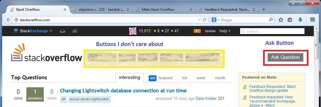
The "Ask Question" button and the question-filtering buttons should not all be grouped together. They are for unrelated purposes and grouping them all together hides the "Ask Question" button from people who ignore the "big group of buttons at the top".

Good grouping:

Good button grouping

The question-filtering buttons are clearly above the question list to which they apply, and are obviously separate from the Ask button.

Bad grouping:

Bad button grouping

The question-filtering buttons are not above the question list, and where did the 'Ask' button go? (I know it's there at the right, but it took a while to notice)

2
  • 5
    It just took me a switch back to the main SO page and then back here because I literally overlooked the Ask question button! I was already wondering if meta was temporarily in read-only mode...
    – Jan Doggen
    Commented Nov 20, 2014 at 19:47
  • 1
    The "Ask" button should be harder to find. Users should be browsing existing questions before deciding they need to write their own. Commented Nov 25, 2014 at 12:27
32

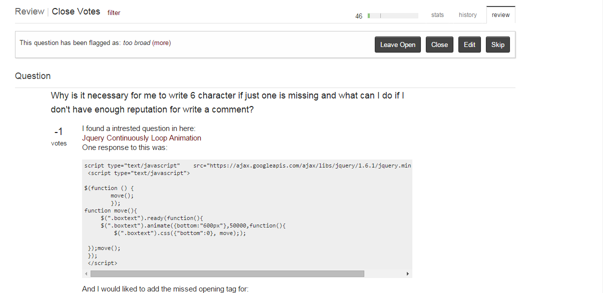
Review is... kind of broken right now.

enter image description here

Note the title and body are offset, and the question info table is way down at the bottom (too far down to get a screenshot of).

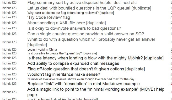
The review history page also looks weird:

enter image description here

The titles are bold... which seems out of place. The questions that are deleted are normal size, making it seem way out of proportion.

Other than that, nice job.

4
  • 7
    will fix in the next build.
    – Jin Mod
    Commented Nov 19, 2014 at 3:30
  • 4
    Great! Did I say how much we love you, @Jin? ;)
    – hichris123
    Commented Nov 19, 2014 at 3:59
  • 7
    I'm surprised by the lack of eeeeekk comments. Is this real life? (I think I just jinxed myself)
    – Jin Mod
    Commented Nov 19, 2014 at 4:01
  • 2
    Yep, it's still real life @Jin. I know because the bacon is right over there.
    – hichris123
    Commented Nov 19, 2014 at 4:04
32

Would it be possible to get improved code block and blockquote formatting? Right now, they look very similar. This has been requested before. Using as an example:

> This is a blockquote with `some awesome code` in it

    This is a codeblock

This is what it currently looks like:

Current design of blockquotes and code blocks

It would be great if something like this were implemented:

Suggested design of blockquotes and code blocks

This makes it easier to differentiate between code blocks and blockquotes, as well as between code and text in blockquotes. I'm fairly confident a similar design is used on other SE sites, but I'm not sure which ones. (I have this set up as a user style in Firefox currently, but I think others would benefit from it.)

One thing to look out for is the colors for spoilers:

Text code

1
  • 1
    This is exactly how it is on the beta sites (not sure about the spoilers). It is definitely easier to tell the difference between a quote and a codeblock. And CodeBlocks inside of quote blocks look awesome this way too.
    – RubberDuck
    Commented Nov 27, 2014 at 3:12
30

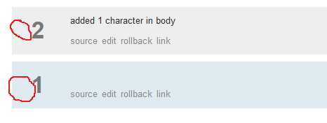
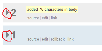
On the revisions page, there are arrows missing that indicate a revision can be expanded/collapsed. Is this intentional?

Meta:

Meta Arrows

Vs. SO

SO

1
  • 10
    We need the arrows. Please bring them back. Commented Nov 20, 2014 at 16:46
27

It's too gray. I understand that meta aims to be visually different by being more gray than the main site, but this is just too much.

The contrast of some areas is very bad; for example take the placeholder texts of inputs. They're barely visible. Similar, the link color is hardly distinguishable from text color. This might look great in theory and certain environments, but fails in practice. Don't forget to consider bad monitors, low-contrast displays, and screens with dark backlights.

The layout changes are nice (except those that are complained about in the other answers), but please fix the color scheme.

2
  • 2
    +1 feels like being back in the 50's a little bit. It'd be nice if it was intended, but it obviously is not. Maybe I should simply get this as a monitor :D monitech.com/images/426_12MONO_CRT_2.png
    – Adriano
    Commented Nov 19, 2014 at 10:11
  • Personally, I absolutely love the grey... Commented Nov 23, 2014 at 17:22
27

It may take a little getting used to...

Urrm no - I doubt I'll be able to get used to it.

I have a visual impairment which means I have to sit with my face about 6-8 inches from my computer screen and that was with SO and SO meta as they were. The changes to fonts, font colour etc, mean I'm seriously struggling to read anything at all.

Sure there are screen "magnifier" apps and "TTS readers" but I don't need them for decent websites or apps and I don't intend to start using them now.

Why do UI designers assume all users have "normal" sight? Art for art's sake is not a valid rationale for UI design. You might as well have taken a wheelchair access ramp from the front of a building and replaced it with stairs as far as I'm concerned.

Seriously - my face is about 4-5 inches from my screen as I type this and I'm having to squint in order to read what I'm typing.

I don't care about logos or other pretty things - do what you like with them. Just make the sites readable again - if it ain't broke, don't try to fix it. Everything was fine as it was before.

3
  • I also find the font changes very hard on my eyes on my laptop and my 27 inch lcd it is forcing me to sit closer to the monitor.
    – drescherjm
    Commented Jan 16, 2015 at 12:59
  • I used to read SO at home on my tiny laptop screen at normal content size ([ctrl]-[0]) but now zoom in one level on the client ([ctrl]-[+]) to get the same comfort. Commented Jan 17, 2015 at 0:24
  • 1
    I wish I could really uproot this - This is the BEST description of the issues I have with the new design. I like the poster read very close to the screen, and I do not need assertive apps for any sites - so needing now I think is a problem with the site. One way to make it betterto increase the font size only and keep the icons etc the same size but I have already been told that StackExchange does not support this
    – mmmmmm
    Commented Jan 18, 2015 at 17:48
26

This has been around for a while, but can we fix the alignment of the comment upvote arrow while updating everything else? Notice the helpful straight line I added - the arrows don't line up when the number in front has a different number of digits.

enter image description here

2
  • Nice catch, I didn't observe it till I read your answer. Commented Nov 20, 2014 at 3:35
  • Neither did I, suggesting that this isn't actually a problem. Commented Nov 25, 2014 at 12:27
26

For the comments section's font I prefer the existing one. In the new theme it seems little unreadable to the naked eye.

Old design enter image description here

New design enter image description here

3
  • 26
    I had to grab a measuring tool and compare the fonts; the new one is only slightly smaller but it feels tiny.
    – Shog9
    Commented Nov 19, 2014 at 4:47
  • 1
    I like it, it is more compact and still readable, saving some space. Just the whitespace on the bottom must be removed.
    – 2501
    Commented Nov 19, 2014 at 21:18
  • Can you please edit your post to explain that the first image is the old design and the second image the new design?
    – A.L
    Commented Nov 22, 2014 at 17:23
26

I've seen lots of useful feedback here, but so far no one seems to have mentioned what for me is the most troubling change (indeed, for me the only troubling change, though I do agree less whitespace in the layout would be better). That is, that the "visited" color of links is practically the same as the "not visited" color.

Not visited: enter image description here Visited: enter image description here

On my computer, and especially on a page with dozens of other questions, it is nearly impossible to tell the difference.

Maybe there's some feature on StackOverflow I'm not aware of that addresses this. Either a better way to know what questions I've read/reviewed already other than seeing the "visited" state of the link, or a way to override the link state colors?

If so, then maybe this isn't such a big problem. If only I could know what the alternatives are. But if I'm already tracking what I've seen on StackOverflow in the best way possible, there needs to be much more contrast between the two link states.


Addendum (workaround): IMHO, this really should be fixed at the StackOverflow level, i.e. in the design itself. However, a little snooping of the HTML document tree provides the information one needs in order to create a style sheet to override the visited link color (a feature I believe most if not all web browsers support, at least on the desktop).

Just create a .css file with the following (or if you already have a custom style sheet, add this to it):

div.question-summary a.question-hyperlink:visited
{
    color: red !important;
}

Then assign that .css file as your custom style sheet.

In Internet Explorer, you can do this by opening the "Internet options" dialog, clicking the "Accessibility" button at the bottom, checking the box that reads "Format documents using my style sheet", and then entering the path for your .css file in the edit box below the checkbox. You will need to close and restart the browser for the new setting to take effect.

I don't have the specifics for other browsers off the top of my head, but I assume the detail can be easily found for someone who wants them.

Naturally, customize the above to suit your needs:

  • I used "red" as the color here, to make the color change unmistakable. Of course, change this color to whatever you want (either a valid named color, or a #RGB-style color value)
  • The above limits the change to setting the color of the visited header links on the question-list page. You can of course use the same technique to override the color choices (or other formatting choices, for that matter) for other page elements. Just inspect the displayed HTML for the page you want to customize to find the correct element type, class, or other attribute you want to select.
3
  • 2
    +100 they should also bring back underlines on hover as well !
    – Amro
    Commented Jan 16, 2015 at 9:21
  • 1
    +maxint, the rest one can probably get used to - but this is going to be a real problem for me. And the difference on meta is somewhat more noticeable, so it couldn't even be easily predicted from the preview. Commented Jan 16, 2015 at 9:43
  • 1
    If anyone sees this without seeing the other question about it, you can find my new color recommendations here and override them manually for now (using something like Stylish). Commented Jan 17, 2015 at 20:00
24

The vertical offset for <sup> is a little ridiculous.

Here's the relevant css:

sup {
    font-size: 80%;
    position: relative;
    top: -0.4em;
}
2
  • How do you do bold inside a code block, like in that last css snippet ? Commented Apr 3, 2015 at 11:31
  • Don't have enough rep to edit on meta.. Will figure it out though :-) Commented Apr 3, 2015 at 13:22
23
  1. You need to switch the .question-hyperlink:hover and .question-hyperlink:visited rules around. Currently, the hover is before the visited, so the visited always overrides the hover, which means the visited will never get the hover effect. Flopping their positions would let visited links have the same hover effect. Same goes for the .answer-hyperlink styles. Footer links are also affected. Not sure what other hyperlink styles might be affected. The plain a elements are functioning correctly though.

  2. Why are the vote arrows orange on Meta? Shouldn't they be dark red or something on Meta and orange on Main? Is the orange just a preview of what they will look like on Stack Overflow? I'm cool with it if it will be fixed in the final release. Just struck me as weird.

  3. When discarding a draft, the "draft discarded" text overlaps a line. Both the "draft saved" and "draft discarded" text are crazily small and unnoticeable.

    Draft Discarded

  4. Images in posts have a margin-bottom: 1em on them? That looks kind of weird, especially in a blockquote (like directly above this). I've never seen that style applied to images on any site before.

  5. The post links are spaced a bit close together.

    Post Links

  6. When viewing the mod menu on a post, the new tab styles connect with the exit button in the top right corner (probably the most minor thing I could complain about).

    Mod Menu Tabs

  7. Why do the tags have a blue border? Did someone copy-paste CSS from the default beta theme?

    Blue Border on Tags

  8. The notice boxes for the closed, deleted, etc notices stick out past the post container. This is much more noticeable when the post is deleted and the boxes go past the red background.

    Notices Boxes Expanding Past Container

1
22

On a Kindle Fire the page is not padded out well from the left side:

enter image description here

6
  • +1 adding some media query to add a bit of left padding for tablet-sized device coul help
    – Adriano
    Commented Nov 19, 2014 at 9:56
  • 5
    +1 I'll comment here instead of posting a related answer this is the same on a iPad. There is not enough padding on both sides, it feels like I'm zoomed in and text is cut off.
    – Taryn Mod
    Commented Nov 19, 2014 at 11:02
  • 3
    Same thing happens on iPhone - zero left margin.
    – nobody
    Commented Nov 19, 2014 at 13:00
  • Chrome on Android - same problem.
    – nicael
    Commented Nov 19, 2014 at 14:59
  • 1
    Or even just in a browser window that isn't very wide. Basically, there's no padding on the page, and there should be (a little bit, just a few pixels). Also: Fluid layout please!!!. Commented Nov 20, 2014 at 8:40
  • I can confirm this for Firefox on Windows 7. Given my OS window border settings, my Firefox window has to be at least 1032 pixels wide in order to get 1 pixel separating the Stack Overflow logo and the left window border. 1031 pixels or less and there is no separation at all. Really, no matter how narrow the window is, there is no good reason to have zero padding.
    – John Y
    Commented Dec 1, 2014 at 22:42
22

The favorite star's active state doesn't have a clean, uniform border. It looks like someone tried to scale the entire shape down... leaving an inconsistent thickness around the edge. That and it looks like there's a leftover polygon in there.

1
21

I was also very shocked at the different looking refresh.

A few things I noticed:

  • The "Asked"/"Viewed"/"Active" lines are really far apart. You could drive a car between them. It's at least twice as big as the current spacing on Stack Overflow.
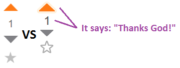
  • The "comment upvote" button is very small. I immediately thought "I'm going to have a hard time hitting that" when I tried to use it. In fact; all the buttons seem a bit smaller; the comment upvote more than others.
    • The arrow tip is also above the number; which just looks weird.
  • "Post Your Answer" appears to be the only "3D" button on the page.
    • Just noticed "Add Comment" is also 3D
  • The comment text entry area is HUGE. The font is twice as big as the posted comment. Not sure if that's intentional or not.
    • The box left edge is also very far from the left of the post compared to the right edge of the button and the right edge of the post. It makes it look imbalanced.

The site looks really clean overall, just a bit of "UI shock" probably :)

6
  • 2
    The bolded titles were annoying and the rest of Stack Exchange sites have moved away from them. They don't need to be bolded, nor should they be.
    – animuson StaffMod
    Commented Nov 19, 2014 at 1:42
  • @animuson That one is obviously not a bug; I just liked the feature :) Commented Nov 19, 2014 at 1:46
  • Removing the feature request; I still liked it though... Commented Nov 19, 2014 at 2:02
  • 2
    Regarding the comment text entry: 1: "area is HUGE" -> I kinda like that, always been annoyed to only have to expand the text area manually. 2: "The font is twice as big as the posted comment. Not sure if that's intentional or not." -> Completely agree! 3: "The box left edge is also very far from the left of the post compared to the right edge of the button and the right edge of the post. It makes it look imbalanced" -> Completelty agree. 4: The "edit comment" module/component is not aligned with the "add comment" module/component. see i.imgur.com/CEej2IQ.png
    – Adriano
    Commented Nov 19, 2014 at 9:49
  • 1
    @AdrienBe Nice catch! Haven't tried editing a comment so I missed the last one. Commented Nov 19, 2014 at 16:54
  • 1
    Agreed on the comment font size! I like that the area is now bigger, but the font size shrinking from when I type to when the comment is posted feels ... disconcerting.
    – Ajean
    Commented Nov 19, 2014 at 19:16
17

H2 and H3 are not significant enough in style difference.

h1

h2

h3

enter image description here

I've often found myself using h2 and h3 because h1 was too imposing in the past. This isn't as much of a problem now, but the h2 and h3 don't seem different enough. When I've used them in recent post I've found that I need to use (lack of) capitalization of the text in addition the header level to indicate the level of the header:

This is h2

this is h3

because the difference between:

This is h2

This is h3

wasn't significant enough to determine if the h3 was a subheader under the previous h2 or a new header at the same level as the h2.


Consider:

Lorem ipsum dolor sit amet, consectetur adipiscing elit.

Ut tincidunt fermentum turpis id interdum. Fusce malesuada cursus dignissim. Proin consequat, arcu in convallis porta, risus lectus malesuada libero, quis tempus lorem lorem a ligula. Suspendisse viverra risus ut urna suscipit, quis sodales mi molestie. Donec dolor est, accumsan ac facilisis a, molestie in ipsum.

Maecenas ultrices dolor sit amet metus placerat, euismod congue ante pharetra.

Quisque fermentum ut ante nec pretium. Praesent efficitur sem lorem, id varius nisi ullamcorper in. Curabitur tristique ultricies magna ut dapibus. Suspendisse potenti. Duis mollis, augue vel lacinia gravida, ante ipsum tempor turpis, a rhoncus eros justo et augue. In hac habitasse platea dictumst. Duis mattis ultrices dui, congue scelerisque ipsum semper eget. Etiam at mattis lorem, sit amet varius justo. Etiam commodo dui odio, sed luctus augue luctus eget. Curabitur mattis ultrices tempor.

In dictum rhoncus neque et efficitur. Duis dictum mollis suscipit.

Duis eu nisl quam. Praesent tristique justo vitae pulvinar imperdiet. Nunc viverra, ante at aliquam eleifend, elit arcu euismod ante, vel ullamcorper turpis ante ac nulla. Nullam ac varius eros, eget semper augue. Pellentesque ac sapien ac orci ultricies lacinia. Morbi eleifend, mi at porttitor efficitur, tortor nibh posuere nibh, quis lobortis odio ante at lacus.

Nam justo metus, ultrices sed massa ut, aliquet lacinia lorem.

Mauris sapien elit, iaculis vitae sapien quis, sollicitudin mattis metus. Pellentesque consectetur, metus ut gravida gravida, odio mi rhoncus felis, bibendum mollis augue leo eget metus. Integer consectetur justo volutpat ligula auctor, et suscipit velit interdum. Aenean euismod sit amet enim non hendrerit. Phasellus faucibus nulla sed posuere cursus. In lectus lacus, interdum imperdiet sapien vel, egestas convallis lacus. Vivamus ullamcorper nunc vel felis feugiat, vitae sollicitudin lacus ultrices.

Aliquam erat volutpat. Morbi tincidunt lorem at finibus dapibus.

Proin arcu neque, elementum quis dignissim vel, semper elementum orci. Praesent id faucibus nisi, quis placerat urna. Donec pretium porttitor aliquet. Vestibulum ex magna, tincidunt sit amet varius sed, vestibulum ut lacus. Nunc dignissim libero ut diam elementum pellentesque.

Phasellus risus dolor, efficitur sed cursus eget, lacinia ac massa.

Curabitur vel pretium leo. Maecenas congue est eget neque consectetur ultricies. Quisque non velit vel lorem semper porta. Morbi sagittis consectetur dolor vitae faucibus. Nulla fringilla ullamcorper eros. Aenean lobortis nunc sit amet erat cursus, sed luctus ipsum consequat. Nunc sit amet dui orci. In ut tempor nisl.


Looking at the above passage, can you quickly identify which are the h2 and which are the h3?
2
  • 12
    I thought the first h3 was just a one-sentence paragraph. :/ I think the problem is less with the distinction between h2 and h3... and more with the distinction between h3 and the paragraph text.
    – canon
    Commented Nov 20, 2014 at 14:33
  • 4
    Agree with canon. If headings used bold font this would be less of an issue.
    – user3717023
    Commented Nov 20, 2014 at 14:51
16

When editing a post, the tags look dull: just a nondescript grey circle in them (maybe a missing image):

enter image description here

Only when hovering the mouse over them do you get an actual image:

enter image description here

0
16

Edit: Fixed now.


I don't have a problem if you change the colours for syntax highlighting, but please keep them consistent. Let's use the R language as an example. Colours used to be quite different for numbers/strings and keywords. Now they are almost impossible to distinguish. Example:

f <- function(x) 42 

function and 42 actually have different colours, but it's really hard to see that. Please fix the colour scheme of syntax highlighting.

1
  • Yep - we're sorry about this, definitely not an intentional change.
    – Nick Craver Mod
    Commented Jan 17, 2015 at 14:12
15

Yay, less bad!

.mainnav's color contrast is 3.37:1. That's too low. Me no can see. Make it 5 at least since it's… the .mainnav.

Post body text is kinda big, comparing it to the text in this textarea and the tags and .post-menu anchors. Make the small things less small, and the big post body text less big. The vote count especially should be substantially larger.

2
  • 5
    To follow up on that WCAG 2.0 (AAA) says at least 7:1 or (AA) 4.5:1. This can matter a lot for people with less-than-optimal eyesight. See standard and online tool for checking contrast.
    – ivarni
    Commented Nov 19, 2014 at 10:42
  • 5
    It matters a lot to people without disabilities too, I can't easily read it.
    – bjb568
    Commented Nov 19, 2014 at 15:24
15

Please put the horizontal lines back in the comments section. It did a lot for my ability to scan the comments, and that feature is gone now. If they're still there, please make them more visible.

2
  • 5
    They are still there, they are just less visible now. I agree that they should be darker. They are so light now that sitting slightly above eye-level with a non-IPS monitor can render them invisible.
    – TylerH
    Commented Nov 19, 2014 at 16:57
  • Wow, I had to go back and look when TylerH said they were still there, because I didn't remember them. They're really close to invisible. Commented Nov 20, 2014 at 8:41
15

I don't want to say any layout is better than the other one, but there are a few things I'd like to have changed on the new layout:

  1. Why is there so many space? For example here in the StackSnippet, I don't need that big buttons: Enter image description here On the old layout, the buttons were smaller, but there was very much useless padding, and there is even much padding left: Enter image description here And this is for most buttons here so, for example, the one to upload an image is equivalent, but the button to post an answer has a much smaller text size in it. Please don't make the buttons look so different.
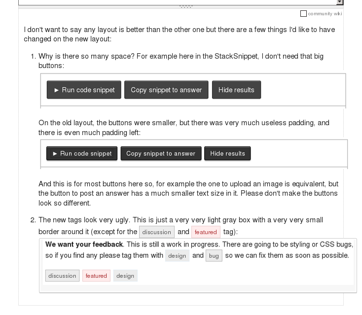
  2. The new tags look very ugly. This is just a very very light gray box with a very very small border around it (except for required or mod-only tags like or ): Enter image description here

  3. The border when posting an answer doesn't have any effect on pictures. The worse thing is that this is still like that after I posted my answer!!! Here is an example from my answer: Enter image description here Please note that the images are all wrongly assigned the same way, so there must be an invisible border right to the visible border where the images are shrinked as they probably should.

  4. As already mentioned by many other answers, I really dislike the new vote layout. Please use the old one again, I really liked the vote images on the old layout

  5. I really dislike the new Stack Overflow logo. The old one looked so much better than the new one:
    Enter image description here

  6. The comment post box is very much too big, and has too much padding: Enter image description here

The new layout looks to much like Windows 8 to me. But I'm sure you can improve it so that it doesn't always remind me on that bloody OS.

I use Mozilla SeaMonkey on Debian K-Wheezy.

2
  • You know the comment box is resizeable, right? Although I really want to be able to re-size the box laterally as well as vertically.
    – TylerH
    Commented Nov 19, 2014 at 16:56
  • @TylerH Yes I know that my browser supports resizing all textareas (no matter if the webpage allows) but I think the default size is too big
    – msrd0
    Commented Nov 19, 2014 at 17:50

Not the answer you're looking for? Browse other questions tagged .